Responsive Design: Basics and Best Practices
Hello everyone, this is Asuka from Supasaito.
Let me ask you—when you search for websites, do you usually use a computer or a smartphone?
These days, over 80% of users browse websites on their smartphones. Especially among younger generations, most people use their phones to access websites.
Given this trend, having a “responsive design” is absolutely essential when building a website.
So, what exactly is responsive design?
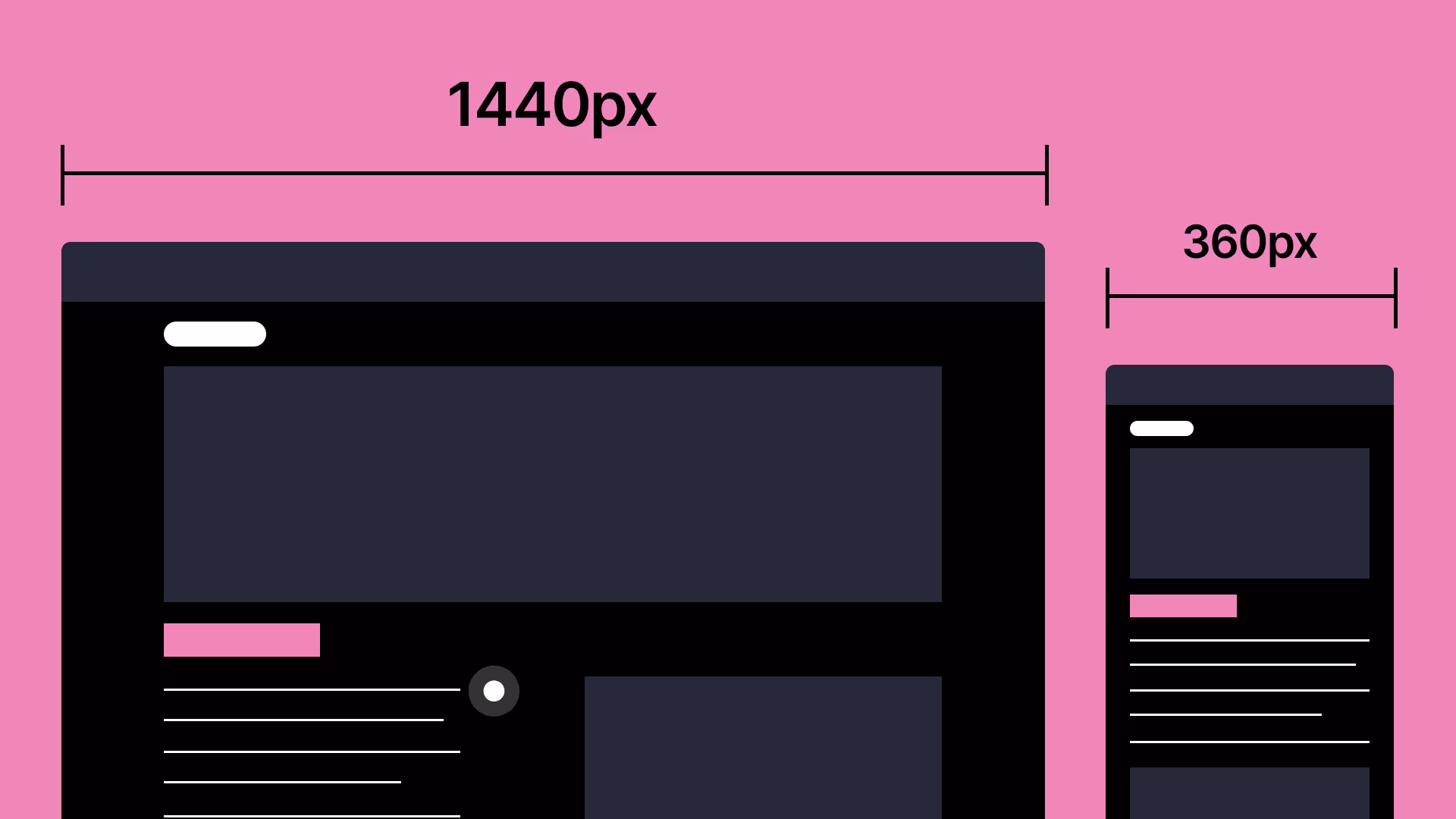
What is Responsive Design?
In recent years, the devices people use to access websites have diversified—ranging from desktop computers to smartphones and tablets.
“Responsive design” refers to designing a single website in a way that it automatically adjusts to the user’s device, providing an optimized and easy-to-read layout.
If you use a design made for desktops on a smartphone without adjustments, the text becomes tiny and difficult to read because of the different screen sizes.
To ensure visitors have a pleasant experience browsing your site, responsive design is a must.
Benefits of Responsive Design
1. Easier Site Management
With responsive design, you only need one version of your site. It adapts to various devices—desktop, tablet, and smartphone—so you don’t have to create and manage separate versions. Updates and edits only need to be done once, making maintenance much simpler.
2. Improved SEO
Since all devices access the same URL, it becomes easier for search engines to index and rank your site higher in search results.
3. Easier URL Sharing
Because there’s only one version of your website, there’s only one URL. This makes it easier to share the link on social media, and users can access it from any device.
4. Better Readability
Without responsive design, layouts can break or content may not display properly depending on the device. By implementing responsive design, you ensure a clean layout across all devices, leading to a more comfortable user experience.
Why Use Webflow for Responsive Design?
We’ve talked about the benefits of responsive design, but what are the specific advantages of using Webflow for this?
Webflow allows you to build responsive designs for a wide variety of devices.
Typically, responsive design covers desktops, tablets, and smartphones. But with Webflow, you can also create layouts for smartphones in landscape mode or large desktop screens.
This means you can craft a user-friendly site that’s optimized for every type of device your audience might be using.
In Conclusion
Today we’ve explored the many advantages of responsive design.
If your site is hard to navigate or read, even users who land on it will quickly leave. Ensuring your website is responsive is key to providing a smooth and enjoyable browsing experience for all your visitors.