AI Search
Just by entering a keyword, the AI automatically picks up relevant lessons, documents, and information.
Searching...
"yyyyy"の結果:xxx 件
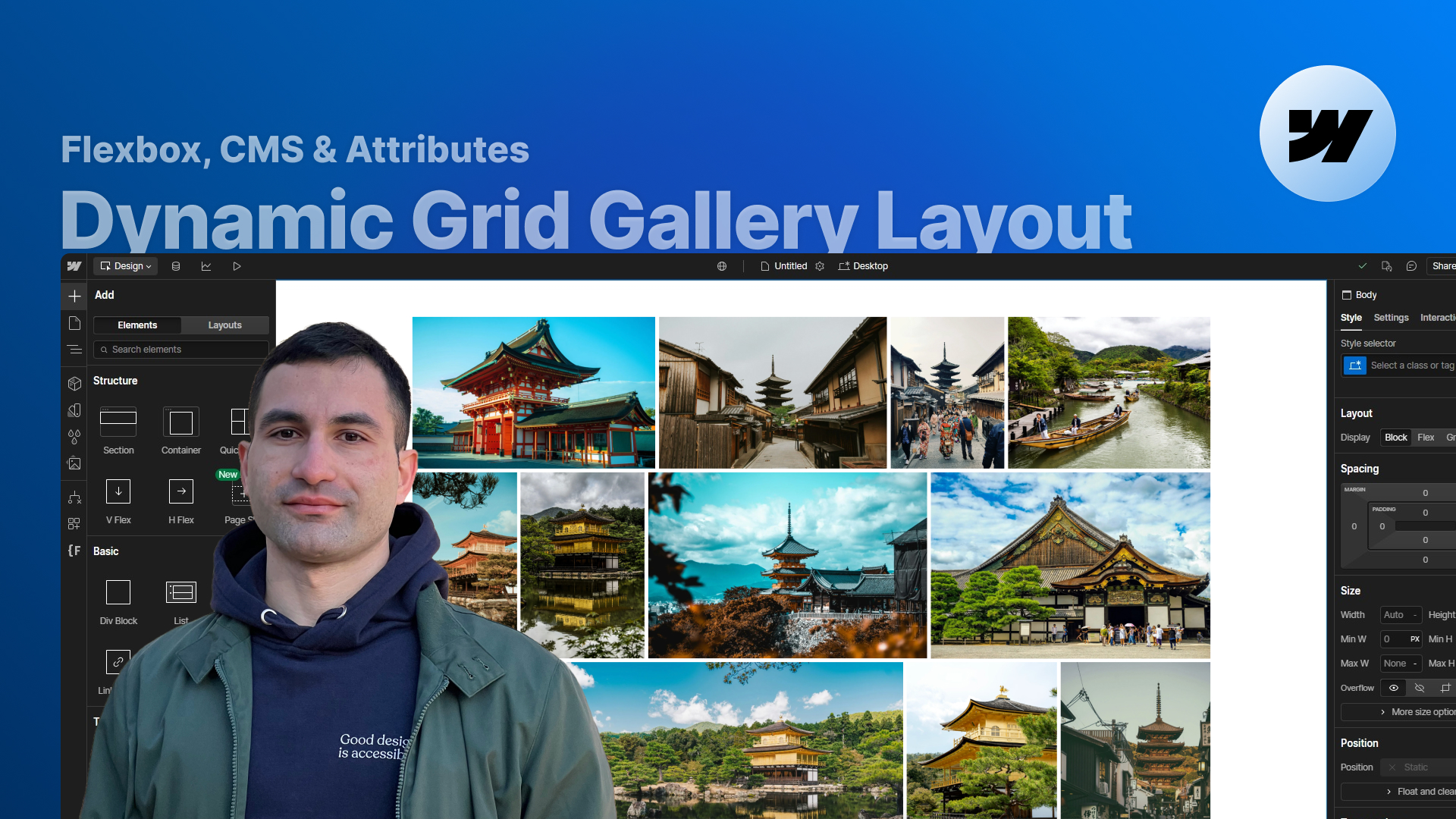
Learn how to build a fully responsive, CMS-driven dynamic grid gallery in Webflow that preserves each image’s aspect ratio, lets you control the number of columns per breakpoint with attributes, and works with both static images and lightboxes — all without writing any custom code.
Dynamic grid galleries are one of those things that look simple… until you try to preserve original aspect ratios, make the layout responsive across breakpoints, and avoid manually adjusting every single image.
In this lesson, we build a fully dynamic grid gallery in Webflow using only attributes + a ready-made script, without requiring you to write any custom code.
You’ll see how to:
All of this is powered by a single script already included in the project and a consistent set of attributes. Your main job is simply to structure the gallery list correctly and apply the right attributes to the gallery wrapper and items.
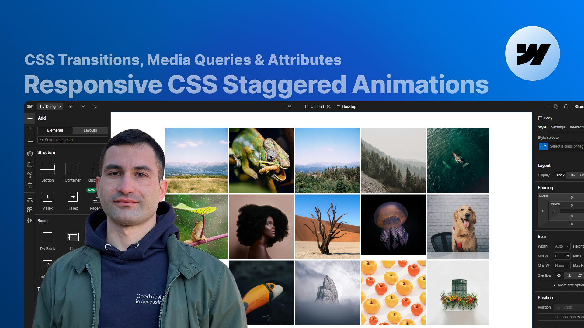
We start with a list of images — some horizontal, some vertical — and the goal is to distribute them into rows and columns while always keeping their original aspect ratios.
Our goal:
The core logic lives inside a script, but configuration happens entirely through attributes.
The main structure relies on the Collection List Wrapper (or any wrapper if using static images).
Key settings:
The important part is the attribute:
This tells the script: “this is one dynamic gallery instance”.
We then define how many columns the gallery should have using attributes like:
If you omit them, the default number of columns is 2 for every breakpoint.
Each value cascades down to smaller breakpoints unless overridden.
Each gallery item (Collection Item or static wrapper) needs:
Inside the Designer we temporarily set the item’s width to ~40–45%.
This is only to prevent Webflow from treating the image as “small” and generating pixelated versions on the live site.
On publish, the script:
This ensures a balanced layout where all images remain proportionate.
Inside each gallery item you can place:
Important settings:
This guarantees that the element fills the entire dynamic width assigned by the script.
If the last row doesn’t have enough images to fill the expected number of columns (e.g. 25 images with a 3-column setup):
The script “pretends” there are missing images by:
This ensures the final row still looks visually balanced.
You can have as many galleries as you want.
Steps:
The script automatically detects and handles each gallery separately.
The structure is identical:
Animations, breakpoints, and dynamic resizing all work exactly the same.
Because the script waits for images to load before making calculations, you might see a slight flicker.
To hide it:
This creates a cleaner loading experience and a more polished design.
By the end of the lesson you’ll have a dynamic grid gallery that:
All without modifying the code — just attributes and a ready-to-use script.
Press "Finished" after you watched the lesson to track your progress