AI Search
Just by entering a keyword, the AI automatically picks up relevant lessons, documents, and information.
Searching...
"yyyyy"の結果:xxx 件
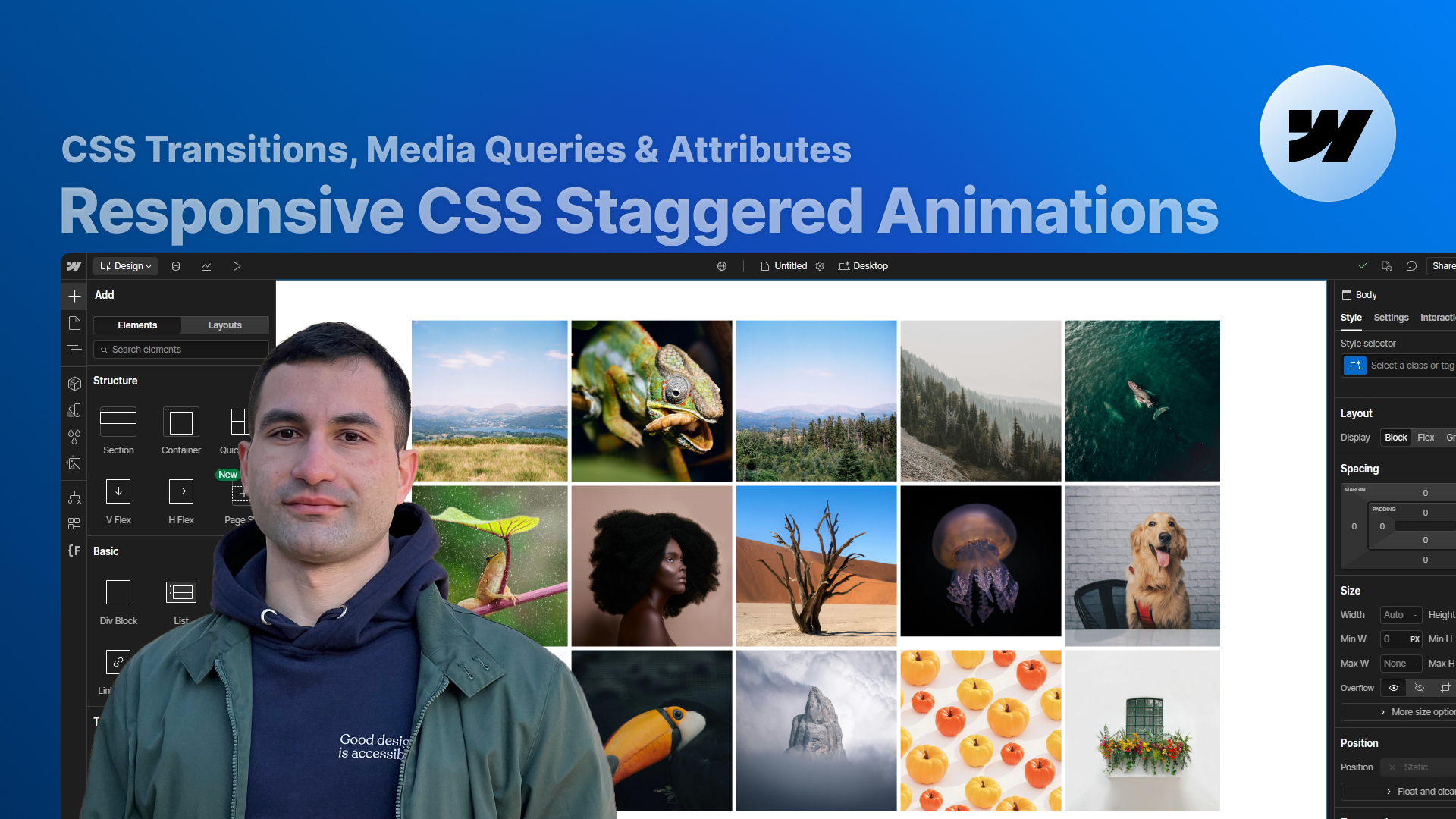
Learn how to build fully responsive staggered slide-and-fade animations in Webflow using only native tools and a bit of CSS. In this lesson, you’ll see how to combine transitions, attributes, and media queries to create reusable animations that adapt to any grid layout — even when working with CMS content.
Creating a clean staggered animation in Webflow sounds easy… until you try to make it responsive, reusable, and maintainable across multiple layouts and breakpoints.
In this lesson, we’ll build a slide-and-fade staggered animation that works beautifully on any device — without writing custom JavaScript. Instead, we’ll rely on:
By the end of the video, you’ll not only understand how the solution works, but also how to adapt it to your own grids, galleries, and CMS-based layouts.
We start from a simple but very common scenario:
you have a responsive grid or gallery, and you want each row of items to slide and fade in with a staggered effect when it scrolls into view.
Webflow lets you:
…but it doesn’t let you detect an entire row or assign a different delay to each item in that row based on its column position.
We briefly look at a “fake solution” where you:
and see why this quickly becomes:
This is the limitation we’re trying to solve.
Once the problem is clear, we rebuild the layout using a single responsive grid and introduce the actual solution.
Each grid item:
Inside Webflow, we create a very simple interaction:
Then we move the “heavy lifting” to CSS:
This keeps the Webflow interaction extremely lean (2 actions only) and pushes the complexity into CSS, where it’s easier to reuse and customize.
The key to a truly flexible staggered animation is teaching CSS how many columns each layout has at each breakpoint.
We use nth-child selectors and media queries to say:
For each breakpoint, we define a small “block” of CSS where:
Once the pattern is clear, you can easily:
In the second example, we push the solution further:
To handle this, we simply:
This lets us control multiple independent staggered animations across the same page without duplicating interactions in Webflow.
Finally, we move to a CMS template page and apply the same technique to a layout built with:
Here, all items come from a multi-image field, so we can’t target them one by one manually.
Thanks to the attribute-based approach, that’s not a problem:
The result:
a fully dynamic, CMS-driven gallery with a clean responsive staggered slide-and-fade animation — all controlled with a small, readable chunk of CSS.
There is one important limitation to keep in mind:
This approach assumes that each row has the same number of columns.
If your layout has rows with different column counts, the logic behind the stagger breaks down.
At the end of the lesson, we briefly discuss this scenario and tease a dedicated follow-up video to tackle it properly.
This tutorial is for you if:
If you’re interested in more advanced layout and animation ideas, you might also enjoy:
Both are part of a growing library of free Webflow resources and cloneables on Supasaito.

Press "Finished" after you watched the lesson to track your progress