
Anyone can use Webflow to create and publish a site, but that makes non-professional users publish the site without thinking about certain important things.
Check the following settings before publishing a Webflow site, which even engineers tend to forget!
So let's get started 🚀.
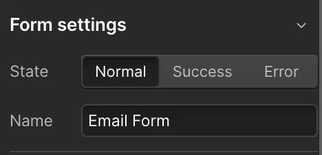
(1) Design of successful and error status of form submission
This form submission success/error state, which is not visible when designing, is an important part of the user experience. When a visitor to the page submits the form, he or she will see something like this by default:

Then, in the case of an error
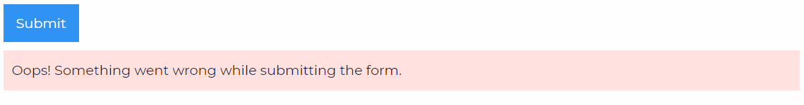
It is in English by default and is not designed at all. It would be embarrassing for customers to see this, so let's switch states from the form settings and design it!
(2) Adjust form names, input names, and formatting
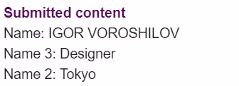
If you add more inputs to the form using the copy plague, the copied input name and ID will be added to the new input with a number, e.g., name-2.
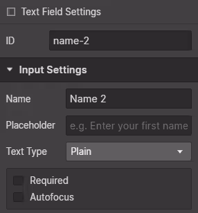
This would make it difficult to understand the items as they are once the form is submitted.
Also check the Text Type from the input settings! If the type is wrong in the copy pest, you will not be able to send it correctly.
(3) Design of the blank state of the Collection List
The collection list may also have no items, so the design of the guide that appears in that case is originally like this:

To match the design, select the Empty state from the collection list settings and design it!

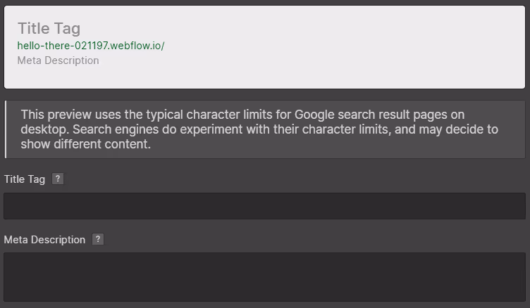
(4) SEO Title and Description
Webflow, thankfully, allows you to set the page title and description that will appear in the search results for each page. Don't forget to enter this information from the page settings!
(5) OG image of the page
When a page is shared on Line or Facebook, an Open Graph Image is often previewed. That image can also be easily set up in Webflow.
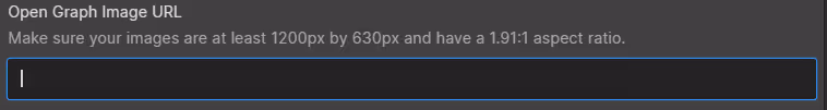
Simply enter the URL of the image!
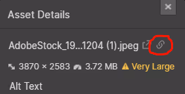
Upload the image from Assets and press this red-circled icon to copy the URL, which can then be used to set up the image in Open Graph.
They want the images to be at least 1200px x 630px in size!
(6) Select active tab
You can select which tabs will be active by default from the tab settings.
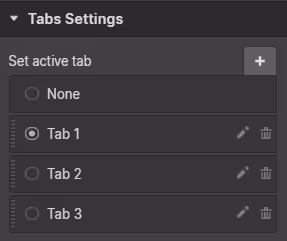
Remember to select the tab you actually want to appear first!
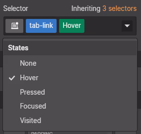
(7) Design of Hover state of elements
For buttons, links, etc., it is recommended to design the Hover state of the element to tell the user, "You can press here" when the mouse over it.
You can change the design slightly by setting the state to Hover from the class settings.
I think the buttons especially need the hover state, but it would be good to see this video on button design.
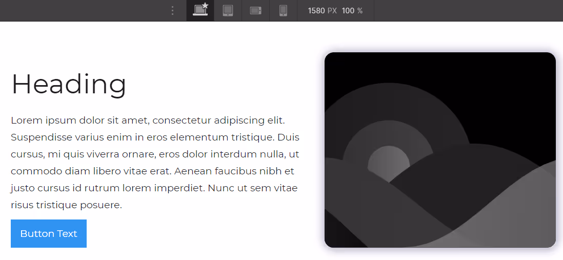
(8) Responsive design
Currently, 80% of Internet usage comes from smartphones, so it is essential to make your website compatible with smartphones.
The site looks like this on my PC,
Of course, it's hard to use this site when it looks like the picture below on a smartphone.
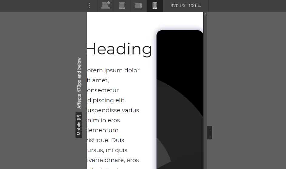
I'm happy to report that Webflow is very easy to make smartphone compatible. Simply match the styling settings of the elements as you switch the size of the screen on the photo from PC to smartphone one by one!
(9) Setting of external links
If a website has an external link (directing you to another website), it is common practice and a natural user experience to open the linked page in a separate browser tab. When setting up external links, remember to check the Open in new tab setting!

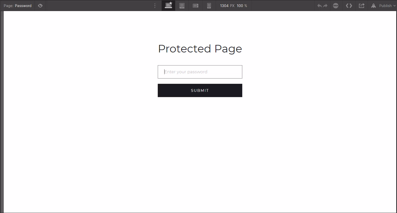
(10) Password page
Every Webflow site has a Password and 404 page by default.
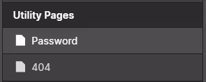
If you have locked the page with a password, you will see this password entry page when you access it. The original design is shown below and is super simple, so by all means clean it up to match your design!
(11) 404 page design
Like the password page, the 404 (page not found) page was originally designed to be very simple.
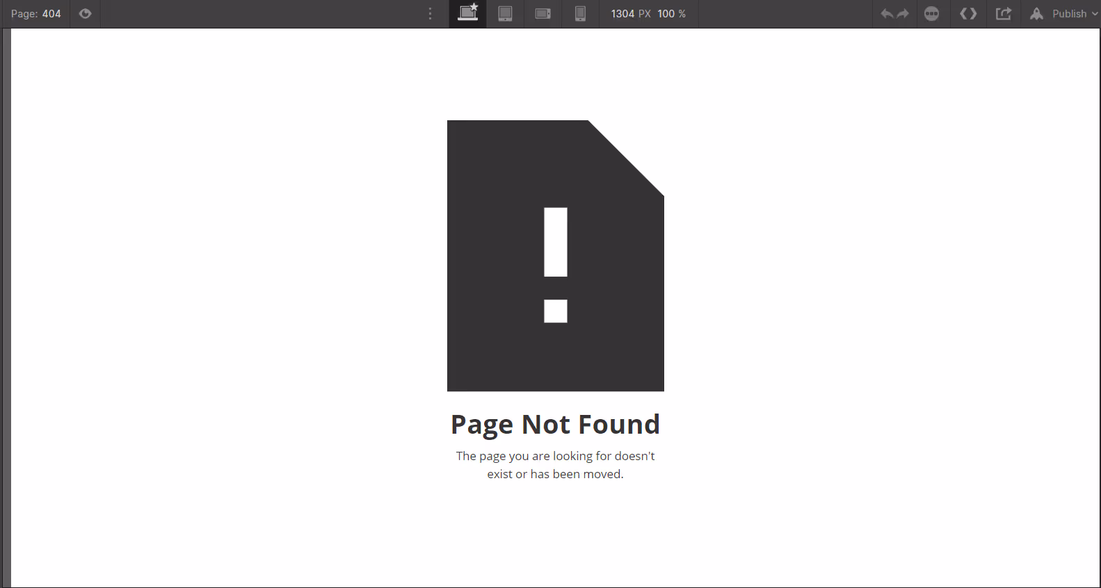
By all means, let's make the 404 page design cool too!
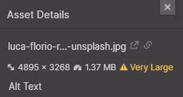
(12) Asset image sizing
If an image used as an asset is too large, it will take a long time to load and slow down the website; Webflow will display a "Very Large" warning if the asset is too large, so replace it with a smaller image when you see it!
(13) Tagging of elements
There is a section for selecting tags in the element settings.
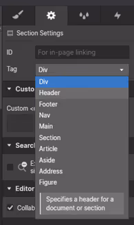
It is the tag that determines how this element is actually reflected in the html. If you set up a section tag for a section, a header tag for a header div, etc., you are more likely to receive a good SEO rating when Google crawls your page! Please check here to enhance your site's SEO.
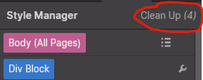
(14) Delete unnecessary Classes
In the course of creating a site, you probably create or delete many CSS classes. In doing so, you will end up with unused and unnecessary classes. Cleaning up and deleting these classes will lighten your site's CSS files and make the entire site faster. Don't forget to remove them!
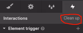
(15) Delete unnecessary animations
Likewise, it is recommended to remove animations (Interactions) as they tend to be unnecessary!
Pressing the Clean up button here will bring up a list of unwanted triggers and animations, as shown below.
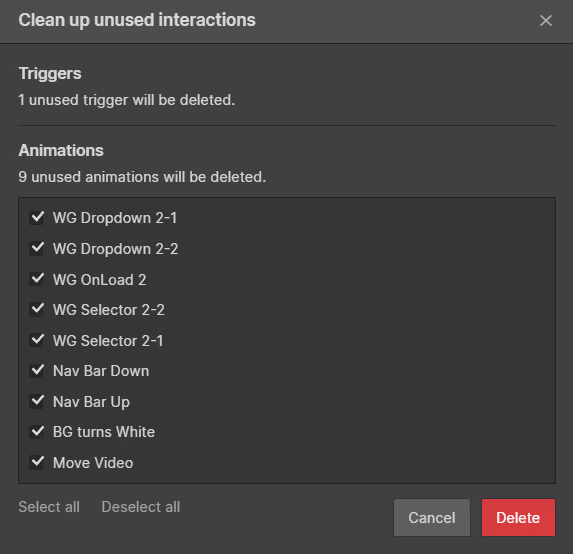
Animations accumulate in the site's JS code, so removing unused ones will speed up the site.


.svg)
