Mastering Native Webflow
.jpg)
Unlock the full potential of Webflow without writing complex code. From mastering foundational CSS positioning and responsive layouts to building award-winning, GSAP-powered animations, "Mastering Native Webflow" takes your development skills from beginner to pro. Step up your design game and build premium, highly interactive websites today.
Target Audience & Prerequisites
- Who is this for: Intermediate Webflow developers looking to level up their interaction design skills, freelance web designers wanting to offer premium, award-winning website builds to their clients, and front-end enthusiasts eager to maximize Webflow's native capabilities with minimal code.
- Prerequisites: Basic understanding of CSS concepts (like classes, margins, and padding) and a free Webflow account. No advanced coding experience is required, as the course relies primarily on native no-code tools.
What You Will Learn
- Master foundational Webflow mechanics, including advanced CSS positioning, class management, and foolproof flexbox and grid layout patterns.
- Build accessible, dynamic CMS-driven components like automatic breadcrumbs, mega menus, and responsive masonry galleries.
- Create award-winning native interactions, from completely no-code 3D scroll-triggered image galleries to interactive custom sliders.
- Design premium visual effects using CSS variables, custom SVG filters, and backdrop blurs to craft Apple-inspired glass navbars, neon glows, and prism text.
- Integrate GSAP seamlessly with Webflow to execute complex, professional-level staggered text reveals and smooth cinematic motion.
Difficulty Level
Difficulty Level: Advanced
This rating is justified because the curriculum moves far beyond basic visual development to tackle highly complex, pro-level mechanics like GSAP-powered staggered animations, custom SVG filters, dynamic CMS custom attributes, and 3D spatial scroll interactions.
Detailed Course Breakdown
Many Webflow developers hit a wall when trying to create premium, highly interactive websites, mistakenly believing that advanced animations, custom SVG filters, and dynamic CMS structures require heavy custom code. You might be struggling with broken responsive layouts, confusing sticky positioning bugs, or clunky animations that don't quite hit that "award-winning" mark.
"Mastering Native Webflow" demystifies the platform by taking you on a comprehensive journey through its most powerful native features. You will start by conquering the essentials, truly understanding classes, flexbox patterns, and CSS positioning rules. From there, you will dive deep into crafting fluid, responsive layouts like horizontal masonry grids and dynamic CMS breadcrumbs with accessibility built-in from the start.
Finally, you will elevate your builds with jaw-dropping visual effects. You will learn to harness native scroll-triggered animations, Apple-inspired glassmorphism, 3D slider interactions, and even integrate GSAP and custom CSS variables for complex neon glows and staggered text reveals. By the end of this course, you will be transformed into a confident, pro-level Webflow developer capable of building sleek, accessible, and deeply interactive experiences that wow clients—all while writing minimal to zero code.
FAQs
Do I need prior coding experience to follow this curriculum?
No coding experience is required! This path heavily focuses on pushing Webflow’s native visual tools to the limit to achieve premium results without writing custom code. Whenever advanced techniques like CSS snippets or GSAP are introduced, the exact code is provided and fully explained step-by-step.
What is the difficulty level, and is it suitable for beginners?
This curriculum is designed to take you from beginner fundamentals to pro-level executions seamlessly. While it covers complex mechanics like 3D spatial interactions and advanced positioning, the step-by-step approach breaks down the logic so you can easily follow along regardless of your starting skill level.
What specific real-world features will I be able to build after completing this?
You will be equipped to build award-winning, highly interactive, and accessible websites. You will confidently create premium features like Apple-inspired liquid glass navbars, dynamic 3D CMS sliders, automated SEO-friendly breadcrumbs, and complex scroll-triggered animations.
How does this learning path differ from standard Webflow tutorials?
Unlike basic tutorials that just tell you which buttons to click, this curriculum focuses deeply on the why and how behind the tools. It teaches you to think in scalable systems, emphasizing professional best practices like accessibility, responsiveness, variables, and clean class management.
Lessons
.jpg)
How to Master Cursor-Tracking Glows in Webflow
This tutorial delivers a streamlined, elegant approach to creating a highly sought-after web design feature: a cursor-tracking glow effect that moves fluidly across a grid of cards while remaining perfectly clipped within each card's boundaries. Rather than relying on heavy, complex JavaScript, the lesson demonstrates how to achieve this sophisticated illusion using a smart combination of native Webflow variables, basic interactions, and a few lines of custom CSS.
The core value of this lesson lies in understanding the power of the background-attachment: fixed CSS property paired with radial gradients. By applying this property, the background behaves as if it is attached to the viewport rather than individual elements, allowing all cards to reveal dynamic, cropped portions of a single, shared background layer. Viewers will learn how to map dynamic viewport units (X and Y variables) to cursor movements, driving the center point of the gradient so the glow appears to travel continuously across the entire grid.
By the end of the tutorial, users will have built a fully functional and highly customizable interactive component, complete with hover-state visibility and seamless viewport tracking. Additionally, the video teaches an ingenious method for creating a synchronized "glowing border" by wrapping elements with a one-pixel padding and mathematically increasing the opacity variable. This empowers creators to deliver high-end, multi-layered interactive user experiences efficiently and with zero added interaction complexity.

Simulating Landscape Viewports in Webflow
For modern web developers, ensuring a flawless user experience across all devices is paramount. However, Webflow currently lacks a native solution to simulate a landscape viewport—such as a horizontally rotated smartphone—directly within the Designer. Historically, addressing this required a tedious, iterative workflow: publishing to a staging domain, opening browser developer tools, manually resizing the viewport, and returning to Webflow to blindly apply fixes. This disjointed process heavily disrupts development momentum and prevents real-time layout validation.
This lesson introduces a highly efficient, non-destructive technique to overcome this limitation by building a simulated viewport system directly inside the Designer. By wrapping the page content in a dedicated container and introducing a custom number variable—acting as a "vertical resizer"—developers can programmatically scale the effective canvas height. Through the strategic application of the calc() function, elements utilizing viewport height (VH) units are mapped to this variable, allowing the layout to react dynamically as the artificial viewport shrinks or expands.
By implementing this setup, viewers will achieve a vastly accelerated debugging workflow. The ability to visualize and interact with a confined landscape environment directly on the canvas instantly highlights structural inconsistencies, such as unintended content overflow or the improper use of fixed heights. Ultimately, this masterclass equips developers with a clean, instantly reversible framework to rigorously test and perfect responsive behaviors without ever leaving the Webflow ecosystem.

How to Create Nested CMS Folder Structures in Webflow
In professional web development, platform constraints often dictate content architecture, forcing developers to compromise on URL hierarchy. Specifically, Webflow’s native environment restricts users from nesting a template page inside a folder that shares a base path with an existing CMS collection (for instance, creating a /blog folder when a /blog CMS collection already exists). This poses a distinct architectural obstacle for developers who want to create a strict, logical hierarchy for their editorial content, such as grouping blog categories directly under the primary blog path rather than having them exist as separate, disconnected entities.
This video provides immense core value by revealing a precise platform workaround—a "glitch"—that empowers developers to bypass this technical limitation. By executing a specific sequence of UI interactions within the Webflow designer, viewers will learn how to unlock a hidden structural capability. Ultimately, the viewer will achieve the ability to nest their editorial taxonomy cleanly within their primary editorial space (e.g., routing a category to website.com/blog/categories/animation), bending the platform's architecture to serve a more intentional, unified content strategy.
Beyond the technical execution of this workaround, the viewer will achieve a modernized understanding of content strategy, specifically regarding Search Engine Optimization (SEO) and Answer Engine Optimization (AEO). The tutorial elevates the lesson from a simple "hack" to a masterclass in content architecture, teaching viewers that modern discoverability relies on clarity, structure, and intent rather than outdated keyword stuffing. By the end of the video, viewers will understand that while a perfected URL structure aids human navigation and logical order, it is the overall coherence of the content and internal linking that ultimately drives success in modern search systems.
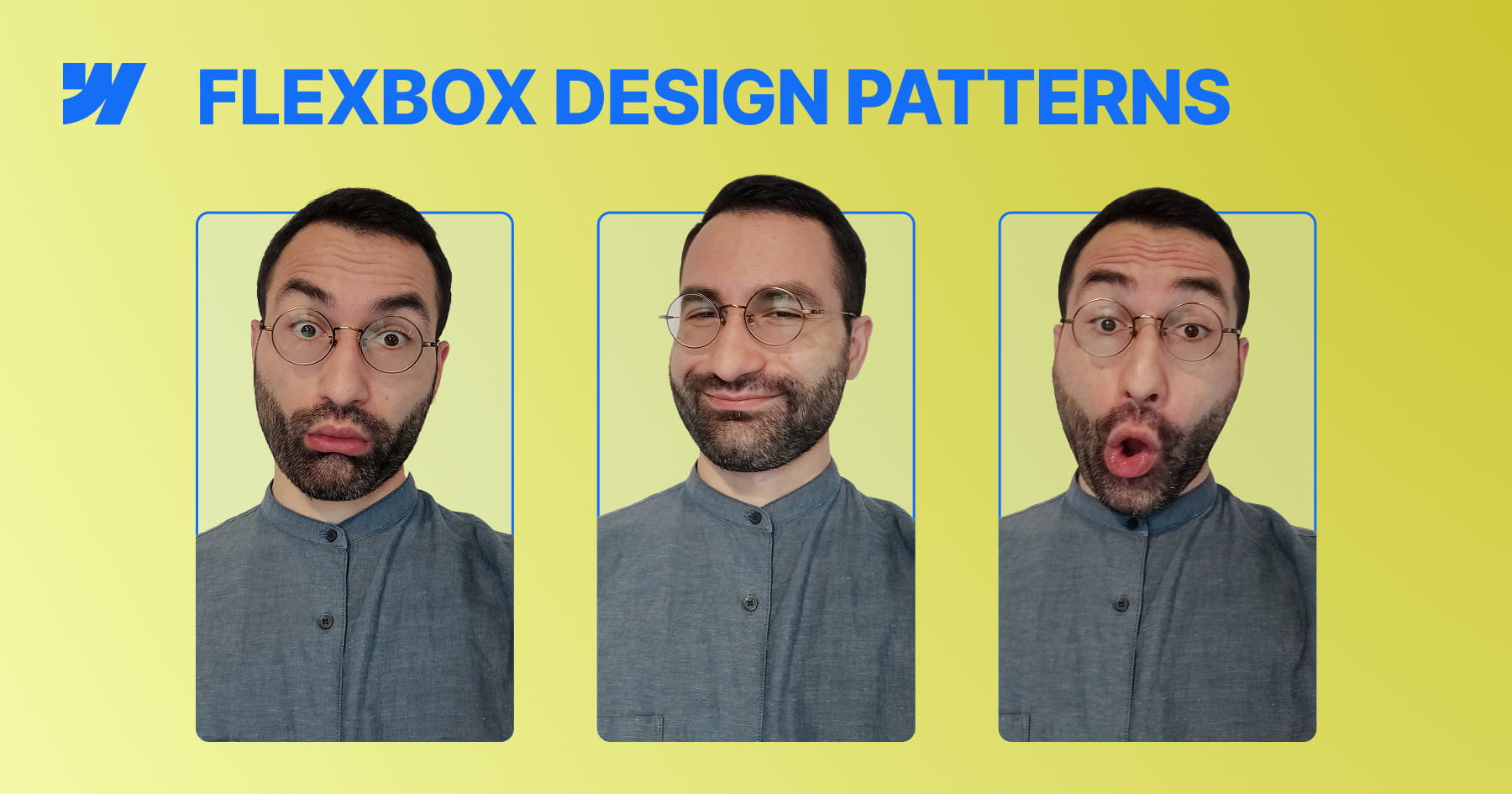
Master Flexbox Patterns in Webflow
This video tutorial transitions from abstract Flexbox theory to the implementation of three essential, practical layout patterns directly within Webflow. By focusing on real-world use cases—such as feature blocks, dynamic grids, and documentation layouts—the content bridges the gap between conceptual understanding and immediate application in professional design projects. The instruction emphasizes building flexible systems rather than static pages, ensuring that designs remain robust across varying content lengths and element counts.
The tutorial guides viewers through constructing "Even Columns" for equal visual weight, "Grid-ish" layouts for adaptive content galleries, and a "Content and Sidebar" structure for hierarchical information. Crucially, the lesson demonstrates how to manipulate core Flexbox properties—specifically flex-basis, flex-grow, and flex-wrap—to solve common responsiveness issues, such as uneven column widths or squashed sidebars, without relying on brittle fixed percentages.
By the conclusion, designers will possess the skills to create resilient, future-proof layouts that naturally adapt to various screen sizes without over-reliance on complex breakpoints. The ultimate objective is to help creators understand "how Flexbox thinks," enabling them to deploy min-width constraints and wrapping logic to build interfaces that are both lightweight and responsive "almost for free".
How to Build a Custom 3D CMS Slider in Webflow
This tutorial provides a comprehensive masterclass on constructing a premium, three-dimensional slider experience within Webflow, transcending standard layouts to achieve a sophisticated visual narrative. Starting with a static structure, the lesson systematically layers depth, motion, and interaction to create a slider where multiple slides are visible simultaneously, employing advanced perspective techniques and native Webflow tools. The objective extends beyond mere aesthetics, aiming to equip designers with a deep understanding of the underlying mechanics—specifically how choices in layout and interaction logic coalesce to form a cohesive, reusable system suitable for professional portfolios and featured content sections.
The technical core of the video focuses on the precise manipulation of the slider mask and CSS properties to achieve a realistic 3D effect. By reducing the mask width while keeping overflow visible, the viewer learns to display adjacent slides while maintaining precise one-by-one navigation control. The tutorial further elevates the design by implementing a custom CSS reflection effect and a complex "Slider Change" interaction involving rotation, scale, opacity, and saturation changes to distinguish active slides from the background.
Finally, the guide bridges the gap between static design and dynamic data by integrating Finssweet’s Attributes solution. This allows the sophisticated animation and structural logic designed for static elements to be seamlessly applied to a CMS-driven collection, ensuring the design is scalable for real-world client projects. The result is a fully responsive, immersive interface that balances visual polish with functional robustness, teaching users to think in systems rather than isolated animations.

How to Build a Swiss Style Poster Animation in Webflow with GSAP
This tutorial provides a comprehensive guide on transforming a static, modernist Swiss poster into a dynamic, cinematic web experience using Webflow and GSAP. The core value lies in bridging the gap between graphic design and interaction development, teaching viewers not just how to build a layout, but how to breathe life into it with sophisticated motion. By following this workflow, designers and developers will master the art of recreating print aesthetics—specifically the balance and composition of Swiss Style—within a responsive digital environment.
The instructional journey begins with a robust structural setup, utilizing Flexbox and precise absolute positioning to layer elements like the central "JM" typography and the letter "A". A significant portion of the training focuses on advanced SVG integration, demonstrating how to use Figma to create boolean vector shapes for clip-paths and, crucially, how to normalize these paths for use in CSS. This technical deep dive ensures that intricate cutout effects scale perfectly across different viewport sizes without losing fidelity.
Ultimately, the viewer will achieve a production-ready build characterized by professional polish. Beyond the layout, the video demystifies GSAP animations, creating complex "slide-mask" illusions where elements move in opposing directions to simulate depth and masking. The tutorial concludes by addressing critical implementation details often overlooked, such as resolving sub-pixel rendering artifacts and preventing "Flash of Unstyled Content" (FOUC) on page load, ensuring the final result is flawless and performant.

How to Master Classes in Webflow
This video serves as a comprehensive technical guide to mastering classes in Webflow, moving beyond basic definitions to explore the "under the hood" mechanics of CSS styling. It addresses the common confusion surrounding class management by clarifying the precise differences between renaming, duplicating, and layering styles. The content is designed to dismantle misconceptions and provide a robust mental model for how styling rules propagate across a project, empowering designers to build with greater architectural precision and confidence.
The instruction utilizes a practical "outfit" analogy to distinguish between core operations: a base class acts as a reusable outfit, while operations like duplicating create independent clones, and combo classes serve as specific modifications tied to a parent style. The video further delineates the strategic hierarchy between local combo classes and global classes, explaining how to create universal utility styles that function across any element regardless of its existing styling.
Finally, the guide equips viewers with the technical foresight required for advanced implementation and custom coding. It details exactly how Webflow sanitizes class names for the live environment—converting text to lowercase, replacing spaces with hyphens, and stripping special characters to ensure CSS compatibility. By understanding these backend transformations, designers can produce cleaner codebases and seamlessly integrate custom CSS or JavaScript without encountering targeting errors.
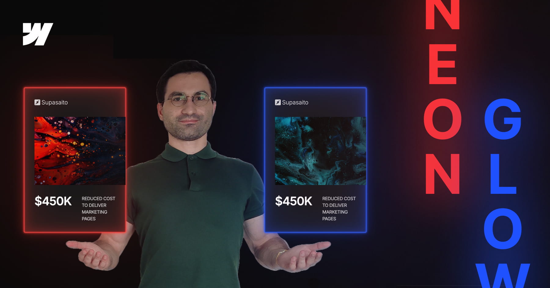
How to Build a Parametric Neon Glow Effect in Webflow
This tutorial invites designers to transcend static styling by building a parametric neon glow system within Webflow, recreating the retro-futuristic aesthetic of Webflow’s previous branding. Rather than manually assigning hex codes for every border and box shadow, the video demonstrates how to engineer a dynamic color architecture where a single "base" variable dictates the entire visual output. By mastering this approach, viewers move beyond simple visual replication to constructing intelligent design systems that are both scalable and mathematically consistent.
The technical core of this lesson focuses on the advanced application of CSS variables combined with the color-mix() function. Viewers will learn to establish a "source of truth" variable and mathematically derive supporting palettes—such as borders, strong glows, and soft diffused light—by mixing the base color with transparency in the perceptually uniform OKLCH color space. This technique ensures that all layers of the glow effect maintain perfect tonal harmony and saturation, regardless of the primary hue selected.
Finally, the tutorial bridges the gap between creative design and efficient development by integrating Webflow’s Variable Modes with Component Variants. While simple combo classes are discussed, the video advocates for a robust workflow where specific color themes (such as Pink, Gold, or Green) are encapsulated within component variants. This empowers designers to switch between complex color systems instantly on a per-instance basis, resulting in a maintainable, production-ready framework that adapts effortlessly to future design changes.
How to Create Advanced Spotlight and Prism Hover Effects in Webflow
This masterclass offers a comprehensive guide to constructing a sophisticated, interactive hero section within Webflow, bridging the gap between no-code design and custom development. The tutorial moves beyond standard layouts to implement a dynamic "spotlight" effect that tracks user cursor movement, creating an immersive focal point for portfolio or landing page designs. By layering distinct interaction models, the viewer learns to manipulate the DOM structure—specifically utilizing relative and absolute positioning—to ensure visual elements stack correctly while maintaining responsiveness across viewports.
The instructional value deepens as it introduces a hybrid approach to animation, combining Webflow’s native "Classic" interactions with the platform’s newer GSAP-powered capabilities. Viewers are guided through the logic of radial gradients to simulate lighting, using precise viewport-based units to synchronize the spotlight's movement with the mouse cursor. Furthermore, the lesson addresses critical edge cases in interaction design, such as preventing layout breakage when animated elements reach the viewport boundaries, by employing advanced sizing and offset techniques.
Finally, the tutorial elevates the design by integrating custom code and SVG filters to achieve a premium "prism" distortion effect. Viewers will acquire practical experience in embedding HTML to define complex filters (specifically manipulating RGB channels via feColorMatrix and feOffset) and writing JavaScript to animate these parameters. The result is a professional-grade asset that demonstrates how to seamlessly blend standard Webflow visual development with the power of GreenSock (GSAP) timelines for bespoke, high-performance web experiences.

How to Master Hover Underline Animations in Webflow
This tutorial provides a sophisticated guide to elevating standard web design by replacing static borders with dynamic, smooth-growing underline animations in Webflow. Presented by Franchesco from SupaSaito, the lesson moves beyond basic styling to explore the creative power of inner box shadows combined with CSS transitions. By mastering these properties, designers can create elegant interactive elements that respond fluidly to user engagement without writing a single line of custom code.
The curriculum follows a structured progression, beginning with the fundamental "growing from the bottom" effect before expanding into complex variations. Viewers are guided through manipulating X and Y offsets to control animation direction—creating effects that slide in from the top, left, or right. The tutorial deepens the learning curve by introducing full-height background fills, teaching the precise mathematical relationship between font size and line height required to calculate perfect fill dimensions using viewport width (VW) units.
By the conclusion of this video, you will possess a versatile toolkit of interaction patterns applicable to links, containers, or sections. The session culminates in a "bonus" segment demonstrating how to layer multiple box shadows to animate several borders simultaneously, providing a comprehensive understanding of how to construct complex, multi-directional hover states. This approach ensures your projects maintain a polished, high-end aesthetic with highly reusable CSS classes.

How to Master GSAP Staggered Animations and Split Text in Webflow
This advanced tutorial provides a comprehensive deep dive into mastering Webflow’s new GSAP-powered animation interface, moving beyond standard presets to unlock precise, high-performance motion design. The content guides users through the fundamental shift from classic interactions to the new system, specifically targeting the creation of sophisticated text reveals using custom CSS selectors. By focusing on a hero section case study, the video demystifies the complexities of the new UI, ensuring designers can build animations that are not only visually striking but technically sound.
Viewers will gain a granular understanding of the critical Stagger properties, specifically distinguishing between Offset Time and Total Time—a core concept for controlling animation rhythm. The instruction covers the implementation of the Split Text functionality to animate content by word or character, coupled with masking techniques that create professional "slide-up" reveals. Furthermore, the tutorial explores the From property to manipulate animation directionality (e.g., animating from the center or edges) and the often-overlooked Stagger Ease settings, which define the mathematical distribution of timing intervals.
By the conclusion of this lesson, learners will possess the technical confidence to engineer elegant, intent-driven animations without relying on guesswork. The tutorial ensures that users understand the "why" behind every setting—from opacity transitions to complex timeline distributions—empowering them to replicate high-end design aesthetics found on award-winning websites. This knowledge transforms static typography into dynamic, fluid experiences that elevate the overall user perception of a digital product.

How to Master Responsive Inner Grid Borders in Webflow
This tutorial provides a sophisticated yet streamlined solution for implementing responsive inner borders within Webflow grids, bypassing the platform's lack of native support for this specific styling. By leveraging a combination of the grid gap property—set to a minimal width like one pixel—and a contrasting background color on the parent container, designers can create clean, consistent dividers that function seamlessly across both static images and text elements. This approach offers a robust alternative to complex CSS workarounds, ensuring layouts remain maintainable and visually precise.
The guide moves beyond basic implementation to address critical responsive design challenges, specifically the visual imbalances that occur when column counts change across breakpoints. Viewers will learn to calculate and insert "placeholder" elements to fill orphaned grid cells, preventing unsightly gaps that reveal the underlying grid background color. The instructional content ensures that these structural adjustments do not negatively impact the layout on larger screens by utilizing display properties to hide placeholders where they are unnecessary.
Finally, the video emphasizes high-end professional standards by integrating accessibility best practices and dynamic Content Management System (CMS) logic. Users will master the use of custom attributes, such as aria-hidden="true", to ensure decorative placeholders are ignored by screen readers, thereby preserving a clean semantic structure. The tutorial concludes by demonstrating how to automate this logic within CMS collections using conditional visibility and custom sorting rules, guaranteeing that the design remains scalable and accessible.

How to Master CSS Positioning in Webflow
This comprehensive video tutorial provides a definitive guide to mastering Webflow’s position properties—Static, Relative, Absolute, Fixed, and Sticky—transforming a commonly confusing topic into a set of practical, actionable skills. By moving beyond abstract theory, the content deconstructs how elements behave within the document flow versus when they are removed from it, clarifying how offsets, stacking contexts, and parent containers interact to dictate layout structure. The instructor emphasizes that understanding these fundamental rules is essential for preventing common layout breaks and achieving pixel-perfect alignment.
The core instruction methodically explores each property's unique characteristics and use cases. Viewers learn how Static acts as the default "do nothing" state, while Relative unlocks offset capabilities and Z-index control without altering the surrounding layout flow. The video distinguishes these from Absolute and Fixed positioning, which remove elements from the document flow entirely; the former anchors to specific parent elements, while the latter anchors strictly to the user's viewport, enabling persistent UI elements like navigation bars. Finally, the tutorial covers the hybrid nature of Sticky positioning, including critical troubleshooting advice regarding ancestor overflow properties.
By the conclusion of this guide, the viewer will possess the technical confidence to execute complex design patterns, such as revealing footers, horizontally scrolling tables, and dynamic tables of contents. Users will be able to leverage positioning to create cleaner, more responsive layouts and diagnose alignment issues proactively. The material ensures that designers can purposefully manipulate the DOM structure to achieve sophisticated visual hierarchies rather than relying on guesswork.
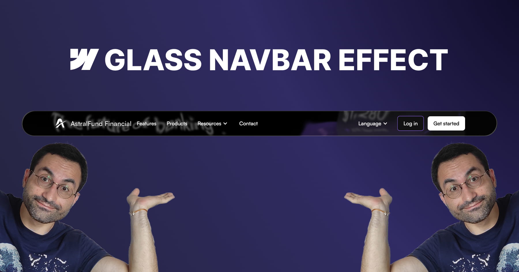
How to Build an Apple-Inspired Liquid Glass Navbar in Webflow
This tutorial provides a comprehensive guide for Webflow developers seeking to replicate Apple’s sophisticated "liquid glass" user interface effect, a design trend characterized by smooth distortion and organic fluidity. The core value of this lesson lies in its accessibility; the instructor demonstrates that achieving this high-end aesthetic does not require heavy external libraries or complex Javascript. Instead, viewers learn to leverage native Webflow elements combined with a lightweight SVG filter to create a professional, performance-friendly visual component that elevates modern UI designs.
The methodology detailed in the video centers on mastering advanced layering techniques to simulate physical glass properties. Viewers are guided through constructing a structured navigation bar containing three distinct layers: one for the blur and distortion, one for a subtle color tint, and a final layer for "shine" using inner box shadows. Crucially, the tutorial demystifies the use of SVG filters, teaching users how to embed custom code to generate a displacement map. This allows for fine-grained control over the distortion effects, enabling the background content to warp organically as it scrolls beneath the navigation bar.
By the conclusion of this module, the viewer will have achieved a fully functional, responsive, and sticky navigation bar that mimics the premium "frosted" look of Apple's recent design language. Beyond the specific effect, the video instills transferable best practices for scalable web design, such as using "inherit" values for border radii to ensure internal layers automatically adapt to their parent containers. Users will walk away with the confidence to manipulate SVG code parameters—specifically scale and turbulence—to customize visual distortions for future creative projects.

How to Build Accessible Manual and Dynamic Breadcrumbs in Webflow
This tutorial provides a comprehensive guide to constructing robust breadcrumb navigation systems within Webflow, moving beyond simple visual aids to create fully accessible and structurally sound interface elements. The presenter, Francesco from SupaSaito, demonstrates how to implement two distinct solutions: a manually configured component designed for sites with shallow architectures, and a dynamic, automated system ideal for complex, nested CMS projects. By following this workflow, developers ensure their navigation is not only aesthetically flexible via Webflow components but also rigorously optimized for screen readers and search engine organization through the use of semantic ordered lists and ARIA attributes.
The first segment details the engineering of the manual breadcrumb, emphasizing the importance of component properties for maintaining design consistency while allowing for content flexibility. Viewers learn to build a reusable component that supports up to four levels of navigation, utilizing visibility properties to toggle between various separators—such as CSS-generated slashes, icons, or text characters—without altering the core structure. Crucially, this section addresses usability best practices by implementing specific logic to disable interaction for non-clickable intermediate paths, ensuring a seamless user experience that avoids broken links.
The final portion of the tutorial elevates the design into a scalable, automated solution powered by custom JavaScript that dynamically generates breadcrumb trails based on the active URL structure. This advanced method eliminates the need for manual updates on every page by automatically detecting path segments, formatting text labels from slugs, and verifying link validity to handle "dead" paths intelligently. Ultimately, the viewer will master the ability to deploy a "set-and-forget" navigation system that adapts to CMS layouts and custom folder structures, significantly reducing long-term site maintenance.

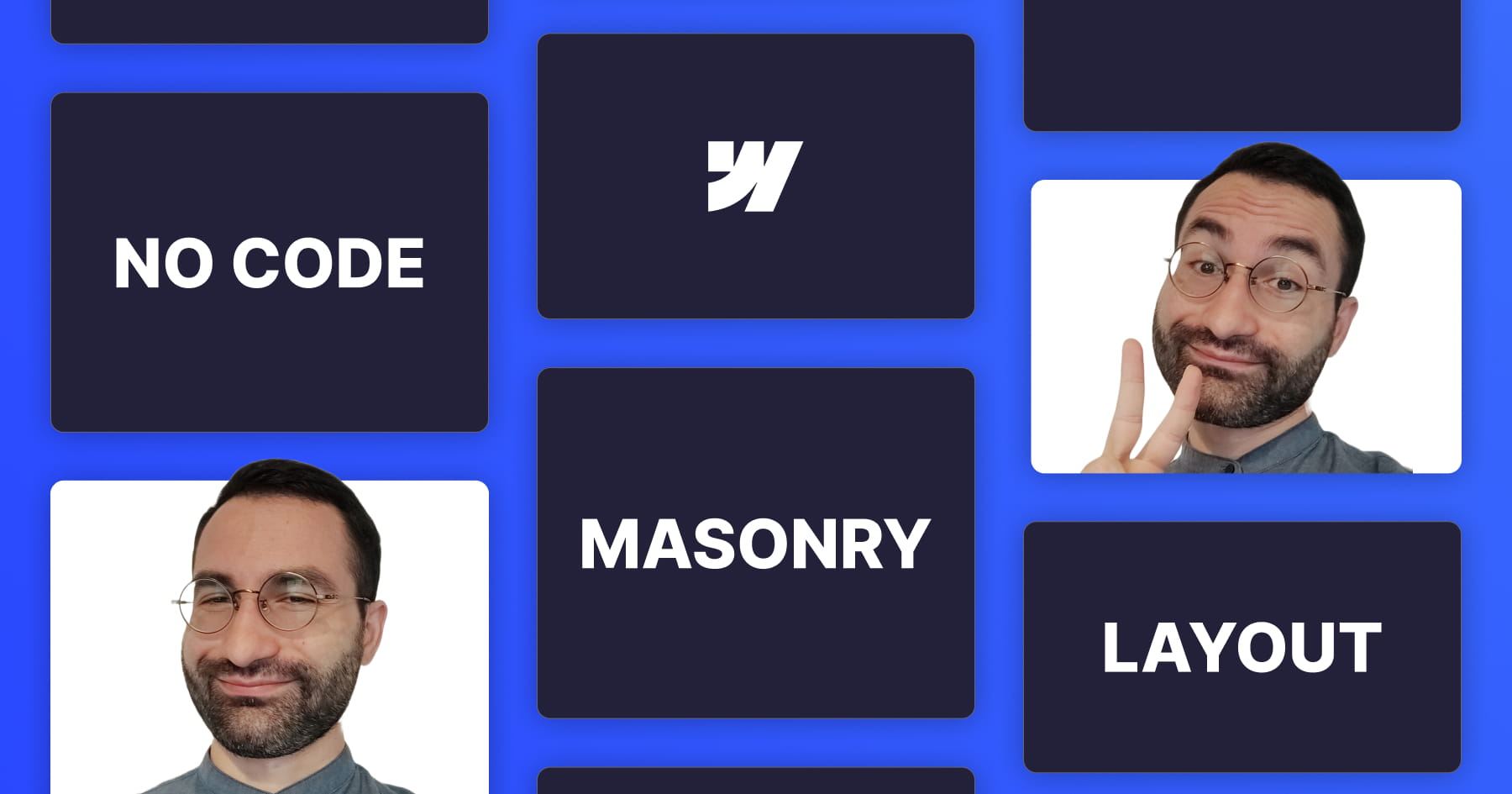
How to Build a Horizontal Masonry Layout in Webflow
This tutorial provides a comprehensive guide to constructing a responsive horizontal masonry layout in Webflow, utilizing Flexbox to achieve a clean, no-code solution. The instructor moves beyond vertical layouts to demonstrate how images can fill horizontal rows while strictly respecting their original aspect ratios, a method inspired by classic CSS techniques. By starting with static elements and progressing to dynamic content, the video ensures viewers understand the foundational mechanics of Flexbox properties—specifically wrapping and sizing behavior—to create a visually cohesive gallery that functions seamlessly across all device sizes.
A central pillar of this lesson is the strict adherence to web accessibility standards. The layout is constructed using unordered lists (<ul>), which allows screen readers to correctly interpret the gallery as a structured sequence of connected items rather than a collection of unrelated div blocks. The tutorial addresses complex edge cases, such as the visual formatting of the final row, by introducing a "phantom" empty list item. Crucially, the presenter explains how to hide this decorative element from assistive technology using the aria-hidden attribute, ensuring the visual fix does not compromise the user experience for those relying on screen readers.
Finally, the video expands the utility of this layout by integrating it with Webflow’s Content Management System (CMS) and adding professional polish through animation. Viewers will learn to manipulate the "Last Item" selector within a collection list to replicate the layout logic dynamically, using custom fields to manage accessibility attributes. The session concludes by demonstrating how to fine-tune responsiveness by switching between viewport height and width units for tablets and mobile devices, and implementing a staggered GSAP animation to create a sophisticated, dynamic entry effect for the gallery items.

How to Build a Logo Glow Hover Effect in Webflow
This tutorial provides a comprehensive guide to constructing sophisticated, "glowing" logo animations within Webflow, utilizing a completely no-code approach. Francesco demonstrates how to elevate standard web elements by combining fundamental transform operations with advanced visual techniques directly in the Webflow Designer. The core value of this lesson lies in demystifying the integration of complex CSS features—specifically custom properties for masking and blur backdrop filters—to achieve a high-fidelity aesthetic that creates a sense of depth and dimensionality usually reserved for custom-coded implementations.
The technical instruction focuses heavily on the structural hierarchy required to support these advanced effects. Viewers will learn to manipulate the relationship between relative and absolute positioning to create a multi-layered canvas where gradient fills and specific aspect ratios interact seamlessly. A pivotal portion of the training covers the use of Webflow custom properties to apply mask images, allowing designers to transform simple div blocks into intricate, logo-shaped elements that serve as the foundation for the glowing visual effect.
Finally, the video culminates in the creation of a dynamic mouse hover interaction that brings the static design to life. By staggering opacity, scale, and movement across multiple layers, the user learns to build a responsive animation that reacts organically to cursor movement. The tutorial covers the entire animation lifecycle—from establishing initial states to applying "ease out cubic" timing functions—empowering designers to build engaging, interactive components that significantly enhance the visual storytelling of their digital products.

Master Glitch Logo Animations in Webflow
This tutorial provides a sophisticated, technical guide on engineering a "glitch" style logo animation within Webflow using a completely no-code methodology. The instructor outlines a specific structural setup involving a "logo wrapper" and three distinct image layers: a relative foreground layer and two absolutely positioned background layers. By manipulating CSS filters on these background layers, the user learns to generate distinct red and bluish-green color offsets that serve as the visual foundation for the glitch effect, eliminating the need for external asset preparation.
The core instruction focuses on constructing the "Logo Glitch Animation" within Webflow’s interaction panel, specifically triggered by a mouse hover state. Viewers will achieve this effect by sequencing rapid "Move" transforms with short durations (0.06 seconds) to simulate jerky, random displacements of the colored background layers. Simultaneously, the tutorial demonstrates how to apply a subtle blur filter to the foreground layer, adding a necessary distortion texture that mimics digital interference.
By mastering this workflow, designers can significantly enhance the interactivity and engagement of brand links or navigation elements without relying on custom code. The technique is demonstrated to be highly versatile, supporting both standard images and embedded SVGs, where the "Current Color" property allows for dynamic styling that integrates seamlessly with the site's design system. This resource ultimately empowers users to deploy high-end motion graphics that elevate the professional polish of their Webflow projects.

How to Build 3D Scroll Animations in Webflow
This instructional video serves as a comprehensive Webflow Master Class designed to guide developers through creating a sophisticated, 3D "while scrolling" animation entirely without code. The core value lies in its detailed breakdown of a complex layout where elements—specifically cards—stack dynamically using sticky positioning and 3D perspective. By leveraging a section height of 600VH to control animation speed and utilizing a sticky main container, the tutorial demonstrates how to transform a standard static layout into an engaging, immersive narrative experience ideal for showcasing client testimonials or process steps.
The technical instruction focuses heavily on the mathematics and logic behind seamless animation timelines. Viewers will learn how to calculate precise offsets and distribute the animation duration across multiple elements to ensure fluid movement. The guide moves beyond simple movements by teaching how to manipulate the Z-axis and "children perspective" properties to create depth, making cards appear to move farther away from the screen as they stack. Additionally, the video covers the integration of Webflow components to streamline the design process, allowing for rapid content updates without breaking the animation structure.
By the conclusion of this tutorial, the viewer will have achieved a fully responsive, high-performance interaction that works flawlessly across all device sizes. The instructor emphasizes a "mobile-first" mindset by using viewport height (VH) units for sizing and spacing, ensuring the animation adapts natively without extensive media queries. Furthermore, learners will master the technique of layering different interaction types, combining "while scrolling" triggers with "scroll into view" effects to maximize user engagement and visual polish.
How to Build a Webflow Masonry Layout
This tutorial provides a streamlined, no-code solution for Webflow developers seeking to implement complex masonry layouts—often referred to as Pinterest-style grids—without relying on custom JavaScript or external plugins. Hosted by Francesco, the guide demonstrates how to repurpose Webflow’s native typography settings to organize content of varying heights into cohesive columns, bypassing the limitations of standard Grid or Flexbox systems for this specific design requirement. The content is structured around two practical real-world applications: a dynamic testimonial section and a responsive image gallery.
Viewers will master the technical implementation of this layout by manipulating the "Columns" property within the typography panel and adjusting gaps and margins for optimal spacing. Crucially, the video addresses a common technical pitfall where content splits awkwardly between columns; the presenter solves this using a specific CSS custom property, ensuring each element remains intact. Additionally, the lesson covers essential responsive design techniques, allowing for the seamless reduction of column counts across tablet and mobile breakpoints.
Beyond mere implementation, the video offers a critical analysis of this method, balancing its speed and ease of use against limitations such as vertical content flow and potential spacing irregularities compared to JavaScript solutions. By the conclusion of the tutorial, designers will be equipped to enhance user experience through native scroll animations and deploy fully responsive, maintenance-free masonry grids that integrate perfectly with Webflow’s CMS.

Master Scroll Animations in Webflow
This tutorial provides a comprehensive masterclass on engineering sophisticated, native scroll-triggered animations within Webflow, eliminating the need for custom code. The core value lies in teaching developers how to seamlessly transition hero section elements—whether they are standard image logos, 3D Spline models, or typography—into a fixed navigation bar as the user scrolls. By leveraging a structure where the hero section "sticks" to the top of the viewport, the video demonstrates how to execute fluid transformations that scale down and reposition elements with pixel-perfect precision.
The instruction goes beyond basic movement, delving into advanced workflow techniques such as the integration of Webflow Variables to animate properties like font size and navbar padding. The tutorial analyzes four distinct architectural scenarios, ranging from simple centered logos to complex bottom-aligned text that requires precise calculation to land centrally in the navbar. Significant emphasis is placed on the use of consistent viewport units (VH and VW) to ensure that animations remain responsive and retain their aspect ratios across different device sizes.
By mastering these techniques, the viewer will achieve the ability to manipulate animation timing and velocity through the strategic sizing of layout elements. The video demystifies the logic behind animation boundaries and offsets, providing the mathematical formulas necessary to control exactly when an interaction begins and ends. Ultimately, learners will walk away with the skills to transform static designs into immersive, dynamic interfaces that feel "alive" and professional.