Creative Animations & Layouts in Webflow
.jpg)
Elevate your Webflow builds from basic to breathtaking with this complete guide to premium animations and advanced layouts. Master award-winning interactions, seamless GSAP integrations, and powerful CSS magic—all without writing complex custom code. Click to discover how you can start building immersive, highly interactive websites today.
Target Audience & Prerequisites
- Who is this for: Intermediate to advanced Webflow developers, freelance web designers, and agency owners looking to elevate their portfolios with highly interactive, premium animations and advanced layouts.
- Prerequisites: A solid understanding of Webflow's core interface and native interactions, and a free Webflow account.
What You Will Learn
- Build complex, award-winning scroll interactions and 3D native Webflow animations using sticky positioning, clipping paths, and perspective.
- Master advanced CSS techniques including Flexbox design patterns, dynamic grid layouts, and the new Webflow variables with color-mix functions.
- Integrate powerful GSAP animations—like draggable sliders, split-text reveals, and staggered effects—using highly configurable, attribute-based no-code solutions.
- Design high-end visual effects such as Apple-inspired glass navbars, liquid gradients, SVG filter distortions, and neon glows to give your projects a premium feel.
- Optimize your immersive layouts for perfect responsiveness and accessibility, ensuring your interactive CMS-driven galleries look flawless on any device.
Difficulty Level
Intermediate
The course introduces complex concepts like GSAP animations, WebGL distortion, and SVG filters, but strategically abstracts the heavy JavaScript coding into ready-to-use HTML attributes, making advanced frontend techniques highly accessible to users with foundational Webflow knowledge.
Detailed Course Breakdown
Many Webflow developers hit a wall when trying to create truly bespoke, top-tier interactions. You see award-winning websites with fluid liquid gradients, 3D scroll effects, Apple-style image sequences, and GSAP-powered draggable elements, but figuring out how to replicate them without getting bogged down in complex JavaScript feels impossible. You often find yourself stuck relying on basic fade-ins or bloated external libraries that can ruin site performance and accessibility.
"Creative Animations & Layouts in Webflow" is designed to completely shatter that wall. Throughout this comprehensive learning path, you will dive deep into the mechanics of high-end web design using a low-code/no-code approach. You will explore everything from mastering fundamental CSS positioning and flexbox masonry layouts to implementing advanced SVG filters, variable color modes, and custom element text reveals. We will also seamlessly integrate the power of GSAP using simple, attribute-based solutions, allowing you to trigger disintegration effects, dynamic sliders, and staggered animations with just a few clicks.
By the end of this course, you will no longer just be building websites; you will be crafting premium, interactive digital experiences. You will have the confidence to look at an Awwwards-winning site and know exactly how to deconstruct and recreate its magic using Webflow's native tools, CSS properties, and attribute-driven GSAP. Transform your portfolio, command higher rates, and become the go-to Webflow expert for creating unforgettable, fluid web animations.
FAQs
Do I need previous coding experience to follow these tutorials?
Not at all. This curriculum focuses heavily on "no-code" and "attributes-only" solutions. Even for complex integrations using GSAP, jQuery, or WebGL, the JavaScript is pre-written for you to easily copy, paste, and configure using simple custom HTML attributes directly inside the Webflow designer.
What exactly will I be able to build by the end of this learning path?
You will be able to confidently build premium, "award-winning" interactive components. Real-world outcomes include Apple-style liquid glass navbars, GSAP-powered draggable cards, 3D immersive scroll sliders, interactive fluid gradient backgrounds, and dynamic masonry galleries ready for high-end client sites.
How does this curriculum differ from standard Webflow beginner tutorials?
Unlike basic tutorials that just show you where to click, this path acts as a masterclass that merges Webflow's native tools with industry-standard libraries like GSAP. It teaches scalable layout architecture, deep CSS mechanics (like Flexbox and sticky positioning), and emphasizes web accessibility and responsiveness across all devices.
How difficult is this curriculum, and what is the expected time commitment?
The difficulty ranges from confident beginner to advanced intermediate. Because the complex math and coding are abstracted into ready-to-use attributes and clonables, the learning curve is highly accessible. You can easily implement individual, jaw-dropping components in under 20 minutes, though mastering the underlying concepts will reward steady practice.
Can these animations and layouts be used with Webflow CMS for client projects?
Yes, absolutely. A major focus of this curriculum is ensuring that advanced effects are fully compatible with Webflow's CMS. You are taught exactly how to apply custom attributes to collection lists and collection items, allowing you to create dynamic, scalable designs like CMS-driven sliders, drag-and-drop galleries, and staggered animations.
Lessons
%20(1).jpg)
How to Master CSS Hover Effects in Webflow
This tutorial introduces a streamlined approach to creating sophisticated hover interactions in Webflow without relying on the platform's native interaction engine. By leveraging the style panel, state selectors, and a minimal footprint of custom CSS, users can build dynamic card effects—where a hovered card highlights its border and scales its image, while sibling cards elegantly fade to desaturated tones.
The lesson guides viewers through structuring a responsive CMS-driven card grid using flexbox and strategic overflow settings to ensure animations remain cleanly clipped. Instead of tying interaction logic to specific class names, the tutorial demonstrates the advanced practice of utilizing custom attributes combined with Webflow variables. This ensures that styling values, such as scale factors and color shifts, remain centralized, scalable, and easy to maintain across reusable components.
By the end of this session, viewers will have constructed a highly performant hover effect while gaining practical experience with modern CSS pseudo-classes like :has() and :not(). This foundational knowledge empowers developers to write cleaner code, create more expressive relationships between elements, and unlock a new level of intentional, flexible design within their Webflow projects.
.jpg)
How to Master Cursor-Tracking Glows in Webflow
This tutorial delivers a streamlined, elegant approach to creating a highly sought-after web design feature: a cursor-tracking glow effect that moves fluidly across a grid of cards while remaining perfectly clipped within each card's boundaries. Rather than relying on heavy, complex JavaScript, the lesson demonstrates how to achieve this sophisticated illusion using a smart combination of native Webflow variables, basic interactions, and a few lines of custom CSS.
The core value of this lesson lies in understanding the power of the background-attachment: fixed CSS property paired with radial gradients. By applying this property, the background behaves as if it is attached to the viewport rather than individual elements, allowing all cards to reveal dynamic, cropped portions of a single, shared background layer. Viewers will learn how to map dynamic viewport units (X and Y variables) to cursor movements, driving the center point of the gradient so the glow appears to travel continuously across the entire grid.
By the end of the tutorial, users will have built a fully functional and highly customizable interactive component, complete with hover-state visibility and seamless viewport tracking. Additionally, the video teaches an ingenious method for creating a synchronized "glowing border" by wrapping elements with a one-pixel padding and mathematically increasing the opacity variable. This empowers creators to deliver high-end, multi-layered interactive user experiences efficiently and with zero added interaction complexity.
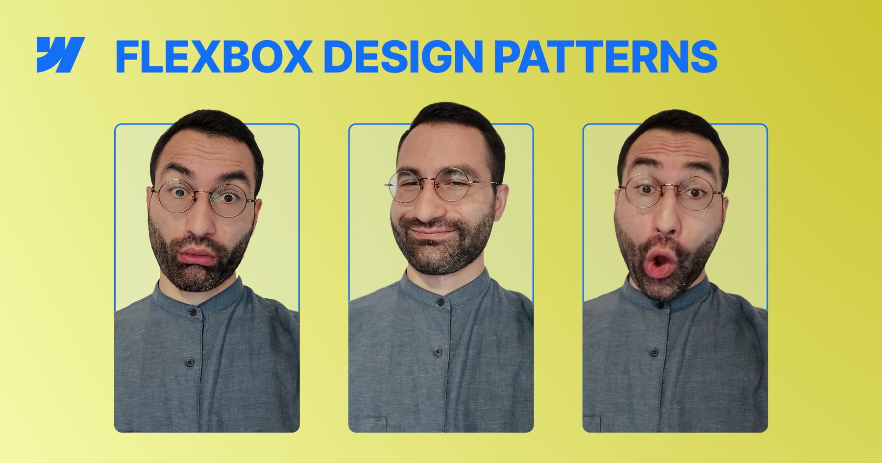
Master Flexbox Patterns in Webflow
This video tutorial transitions from abstract Flexbox theory to the implementation of three essential, practical layout patterns directly within Webflow. By focusing on real-world use cases—such as feature blocks, dynamic grids, and documentation layouts—the content bridges the gap between conceptual understanding and immediate application in professional design projects. The instruction emphasizes building flexible systems rather than static pages, ensuring that designs remain robust across varying content lengths and element counts.
The tutorial guides viewers through constructing "Even Columns" for equal visual weight, "Grid-ish" layouts for adaptive content galleries, and a "Content and Sidebar" structure for hierarchical information. Crucially, the lesson demonstrates how to manipulate core Flexbox properties—specifically flex-basis, flex-grow, and flex-wrap—to solve common responsiveness issues, such as uneven column widths or squashed sidebars, without relying on brittle fixed percentages.
By the conclusion, designers will possess the skills to create resilient, future-proof layouts that naturally adapt to various screen sizes without over-reliance on complex breakpoints. The ultimate objective is to help creators understand "how Flexbox thinks," enabling them to deploy min-width constraints and wrapping logic to build interfaces that are both lightweight and responsive "almost for free".
How to Build a Custom 3D CMS Slider in Webflow
This tutorial provides a comprehensive masterclass on constructing a premium, three-dimensional slider experience within Webflow, transcending standard layouts to achieve a sophisticated visual narrative. Starting with a static structure, the lesson systematically layers depth, motion, and interaction to create a slider where multiple slides are visible simultaneously, employing advanced perspective techniques and native Webflow tools. The objective extends beyond mere aesthetics, aiming to equip designers with a deep understanding of the underlying mechanics—specifically how choices in layout and interaction logic coalesce to form a cohesive, reusable system suitable for professional portfolios and featured content sections.
The technical core of the video focuses on the precise manipulation of the slider mask and CSS properties to achieve a realistic 3D effect. By reducing the mask width while keeping overflow visible, the viewer learns to display adjacent slides while maintaining precise one-by-one navigation control. The tutorial further elevates the design by implementing a custom CSS reflection effect and a complex "Slider Change" interaction involving rotation, scale, opacity, and saturation changes to distinguish active slides from the background.
Finally, the guide bridges the gap between static design and dynamic data by integrating Finssweet’s Attributes solution. This allows the sophisticated animation and structural logic designed for static elements to be seamlessly applied to a CMS-driven collection, ensuring the design is scalable for real-world client projects. The result is a fully responsive, immersive interface that balances visual polish with functional robustness, teaching users to think in systems rather than isolated animations.

How to Build a Swiss Style Poster Animation in Webflow with GSAP
This tutorial provides a comprehensive guide on transforming a static, modernist Swiss poster into a dynamic, cinematic web experience using Webflow and GSAP. The core value lies in bridging the gap between graphic design and interaction development, teaching viewers not just how to build a layout, but how to breathe life into it with sophisticated motion. By following this workflow, designers and developers will master the art of recreating print aesthetics—specifically the balance and composition of Swiss Style—within a responsive digital environment.
The instructional journey begins with a robust structural setup, utilizing Flexbox and precise absolute positioning to layer elements like the central "JM" typography and the letter "A". A significant portion of the training focuses on advanced SVG integration, demonstrating how to use Figma to create boolean vector shapes for clip-paths and, crucially, how to normalize these paths for use in CSS. This technical deep dive ensures that intricate cutout effects scale perfectly across different viewport sizes without losing fidelity.
Ultimately, the viewer will achieve a production-ready build characterized by professional polish. Beyond the layout, the video demystifies GSAP animations, creating complex "slide-mask" illusions where elements move in opposing directions to simulate depth and masking. The tutorial concludes by addressing critical implementation details often overlooked, such as resolving sub-pixel rendering artifacts and preventing "Flash of Unstyled Content" (FOUC) on page load, ensuring the final result is flawless and performant.
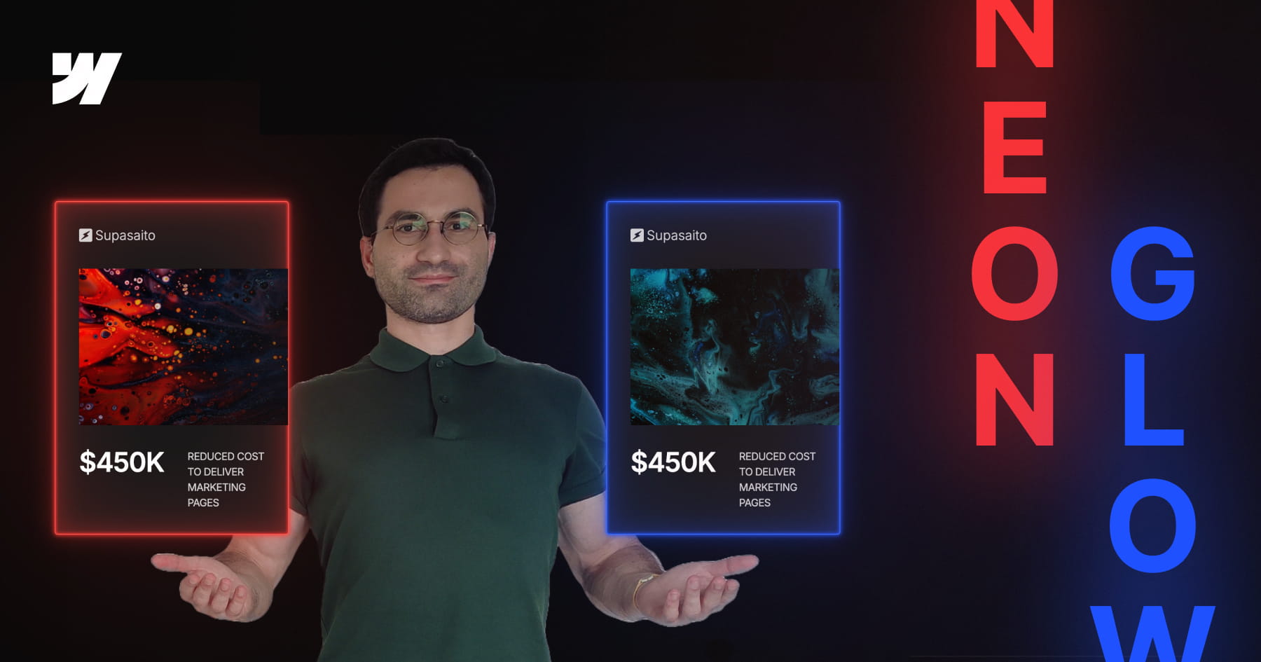
How to Build a Parametric Neon Glow Effect in Webflow
This tutorial invites designers to transcend static styling by building a parametric neon glow system within Webflow, recreating the retro-futuristic aesthetic of Webflow’s previous branding. Rather than manually assigning hex codes for every border and box shadow, the video demonstrates how to engineer a dynamic color architecture where a single "base" variable dictates the entire visual output. By mastering this approach, viewers move beyond simple visual replication to constructing intelligent design systems that are both scalable and mathematically consistent.
The technical core of this lesson focuses on the advanced application of CSS variables combined with the color-mix() function. Viewers will learn to establish a "source of truth" variable and mathematically derive supporting palettes—such as borders, strong glows, and soft diffused light—by mixing the base color with transparency in the perceptually uniform OKLCH color space. This technique ensures that all layers of the glow effect maintain perfect tonal harmony and saturation, regardless of the primary hue selected.
Finally, the tutorial bridges the gap between creative design and efficient development by integrating Webflow’s Variable Modes with Component Variants. While simple combo classes are discussed, the video advocates for a robust workflow where specific color themes (such as Pink, Gold, or Green) are encapsulated within component variants. This empowers designers to switch between complex color systems instantly on a per-instance basis, resulting in a maintainable, production-ready framework that adapts effortlessly to future design changes.
How to Create Advanced Spotlight and Prism Hover Effects in Webflow
This masterclass offers a comprehensive guide to constructing a sophisticated, interactive hero section within Webflow, bridging the gap between no-code design and custom development. The tutorial moves beyond standard layouts to implement a dynamic "spotlight" effect that tracks user cursor movement, creating an immersive focal point for portfolio or landing page designs. By layering distinct interaction models, the viewer learns to manipulate the DOM structure—specifically utilizing relative and absolute positioning—to ensure visual elements stack correctly while maintaining responsiveness across viewports.
The instructional value deepens as it introduces a hybrid approach to animation, combining Webflow’s native "Classic" interactions with the platform’s newer GSAP-powered capabilities. Viewers are guided through the logic of radial gradients to simulate lighting, using precise viewport-based units to synchronize the spotlight's movement with the mouse cursor. Furthermore, the lesson addresses critical edge cases in interaction design, such as preventing layout breakage when animated elements reach the viewport boundaries, by employing advanced sizing and offset techniques.
Finally, the tutorial elevates the design by integrating custom code and SVG filters to achieve a premium "prism" distortion effect. Viewers will acquire practical experience in embedding HTML to define complex filters (specifically manipulating RGB channels via feColorMatrix and feOffset) and writing JavaScript to animate these parameters. The result is a professional-grade asset that demonstrates how to seamlessly blend standard Webflow visual development with the power of GreenSock (GSAP) timelines for bespoke, high-performance web experiences.

How to Create an Animated Glassy Button with SVG & GSAP in Webflow
This masterclass guides Webflow developers through the advanced construction of a "crystal glass" button that dynamically refracts background content to mimic physical optical properties. By moving beyond standard CSS styling, the tutorial demonstrates how to leverage SVG filters—specifically using displacement maps—to create a sophisticated translucent interface element that reacts organically to the scrolling content beneath it.
The technical implementation focuses on embedding global SVG definitions and linking them to UI components via the backdrop-filter property, a technique that allows for complex pixel distortion and blurring. The lesson details the critical role of JavaScript in loading external displacement textures to feed the SVG primitives, ensuring the refractive effect is rendered consistently across different browsers.
Finally, the tutorial elevates the component from a static visual to a tactile interactive element using GSAP (GreenSock Animation Platform). Viewers will learn to build accessible animation timelines that transition the button from a "soft glass" resting state to a "sharp ice" active state upon hover, while also mastering the architecture needed to scale this effect across multiple button instances and pages.

How to Master Hover Underline Animations in Webflow
This tutorial provides a sophisticated guide to elevating standard web design by replacing static borders with dynamic, smooth-growing underline animations in Webflow. Presented by Franchesco from SupaSaito, the lesson moves beyond basic styling to explore the creative power of inner box shadows combined with CSS transitions. By mastering these properties, designers can create elegant interactive elements that respond fluidly to user engagement without writing a single line of custom code.
The curriculum follows a structured progression, beginning with the fundamental "growing from the bottom" effect before expanding into complex variations. Viewers are guided through manipulating X and Y offsets to control animation direction—creating effects that slide in from the top, left, or right. The tutorial deepens the learning curve by introducing full-height background fills, teaching the precise mathematical relationship between font size and line height required to calculate perfect fill dimensions using viewport width (VW) units.
By the conclusion of this video, you will possess a versatile toolkit of interaction patterns applicable to links, containers, or sections. The session culminates in a "bonus" segment demonstrating how to layer multiple box shadows to animate several borders simultaneously, providing a comprehensive understanding of how to construct complex, multi-directional hover states. This approach ensures your projects maintain a polished, high-end aesthetic with highly reusable CSS classes.
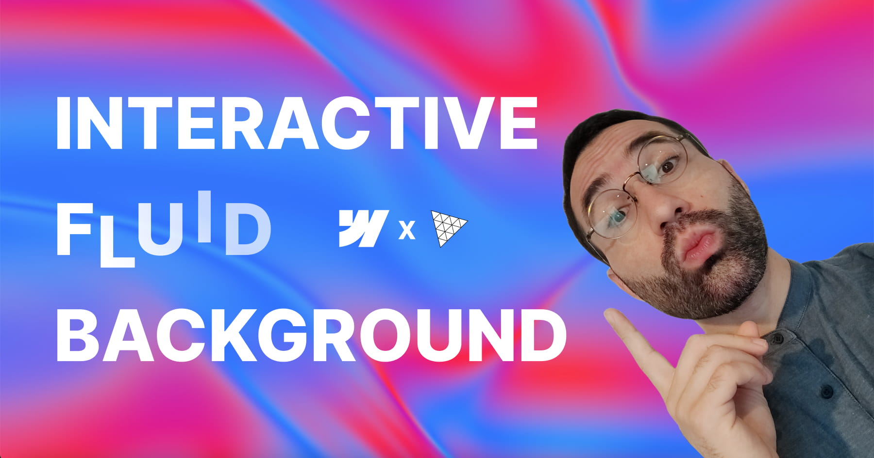
Add Interactive Fluid Gradients in Webflow
This tutorial empowers designers to transform static web backgrounds into immersive, fluid interactive experiences using a high-performance WebGL solution that requires absolutely no coding. By leveraging a custom script built on the powerful 3.js library, users can implement "liquid color" backgrounds that react dynamically to mouse movements, instantly elevating the aesthetic value and interactivity of a site. The video demonstrates that complex shader-based motion effects, often reserved for advanced developers, are now accessible via a simple attribute-based workflow within Webflow.
The core technical value of this lesson lies in its demonstration of a robust configuration workflow that eliminates the tedious "publish-and-check" cycle. Viewers are introduced to a hidden Graphical User Interface (GUI) unlocked by a specific custom attribute (fc-fluid-gradient-gui), allowing for real-time, browser-based fine-tuning of complex parameters such as fluid decay, brush strength, and flow speed. This feature grants designers granular control over the physics and visuals of the gradient, ensuring the final output matches their exact design vision without guesswork.
Finally, the tutorial bridges the gap between visual decoration and functional User Experience (UX) design by applying these fluids to a real-world Hero section. It details how to link the background's behavior to interface elements—specifically, creating a "magnetic" relationship where hovering over a Call to Action (CTA) button intensifies the background’s vibrancy. This technique creates a cohesive, responsive environment that guides user attention and enhances the overall perceived quality of the digital product.

How to Master GSAP Staggered Animations and Split Text in Webflow
This advanced tutorial provides a comprehensive deep dive into mastering Webflow’s new GSAP-powered animation interface, moving beyond standard presets to unlock precise, high-performance motion design. The content guides users through the fundamental shift from classic interactions to the new system, specifically targeting the creation of sophisticated text reveals using custom CSS selectors. By focusing on a hero section case study, the video demystifies the complexities of the new UI, ensuring designers can build animations that are not only visually striking but technically sound.
Viewers will gain a granular understanding of the critical Stagger properties, specifically distinguishing between Offset Time and Total Time—a core concept for controlling animation rhythm. The instruction covers the implementation of the Split Text functionality to animate content by word or character, coupled with masking techniques that create professional "slide-up" reveals. Furthermore, the tutorial explores the From property to manipulate animation directionality (e.g., animating from the center or edges) and the often-overlooked Stagger Ease settings, which define the mathematical distribution of timing intervals.
By the conclusion of this lesson, learners will possess the technical confidence to engineer elegant, intent-driven animations without relying on guesswork. The tutorial ensures that users understand the "why" behind every setting—from opacity transitions to complex timeline distributions—empowering them to replicate high-end design aesthetics found on award-winning websites. This knowledge transforms static typography into dynamic, fluid experiences that elevate the overall user perception of a digital product.

How to Master Responsive Inner Grid Borders in Webflow
This tutorial provides a sophisticated yet streamlined solution for implementing responsive inner borders within Webflow grids, bypassing the platform's lack of native support for this specific styling. By leveraging a combination of the grid gap property—set to a minimal width like one pixel—and a contrasting background color on the parent container, designers can create clean, consistent dividers that function seamlessly across both static images and text elements. This approach offers a robust alternative to complex CSS workarounds, ensuring layouts remain maintainable and visually precise.
The guide moves beyond basic implementation to address critical responsive design challenges, specifically the visual imbalances that occur when column counts change across breakpoints. Viewers will learn to calculate and insert "placeholder" elements to fill orphaned grid cells, preventing unsightly gaps that reveal the underlying grid background color. The instructional content ensures that these structural adjustments do not negatively impact the layout on larger screens by utilizing display properties to hide placeholders where they are unnecessary.
Finally, the video emphasizes high-end professional standards by integrating accessibility best practices and dynamic Content Management System (CMS) logic. Users will master the use of custom attributes, such as aria-hidden="true", to ensure decorative placeholders are ignored by screen readers, thereby preserving a clean semantic structure. The tutorial concludes by demonstrating how to automate this logic within CMS collections using conditional visibility and custom sorting rules, guaranteeing that the design remains scalable and accessible.

How to Add an Interactive Water Ripple Effect in Webflow Without Code
This comprehensive tutorial introduces a sophisticated, no-code methodology for integrating interactive water ripple effects into Webflow projects using a custom attribute system. Hosted by Francesco from SupaSaito, the video demonstrates how to deploy a WebGL-based distortion effect that can be applied to any element—from static hero sections to dynamic CMS galleries—without writing complex JavaScript. The core value of this solution lies in its accessibility and flexibility; it transforms a technically complex jQuery and WebGL implementation into a user-friendly workflow, allowing designers to enhance visual engagement with "zero code" while maintaining strict control over customization and performance.
Viewers will achieve a deep understanding of how to configure these effects using a unique "live tweaking" workflow. By applying specific attributes like fc-repples-config, users generate an embedded GUI panel on the live site, enabling real-time adjustment of parameters such as texture resolution, drop radius, and wave perturbance. This approach eliminates guesswork, allowing designers to visualize the perfect aesthetic in the browser before permanently assigning the values as data attributes within Webflow. Furthermore, the tutorial solves common layout challenges by teaching users how to utilize background image overlays for elements that require structural integrity, ensuring the effect works seamlessly with responsive designs.
Finally, the guide emphasizes the production of professional, high-performance web assets by integrating critical accessibility and optimization features. Viewers will learn to implement global controls for CMS collections using grouping attributes, ensuring scalable management of multiple items. The video also details essential best practices, such as disabling the resource-intensive WebGL effect on mobile devices to preserve battery life and creating accessible toggle buttons that allow end-users to pause the animation. The result is a polished, fully cloneable component that balances high-end visual impact with usability and performance standards.
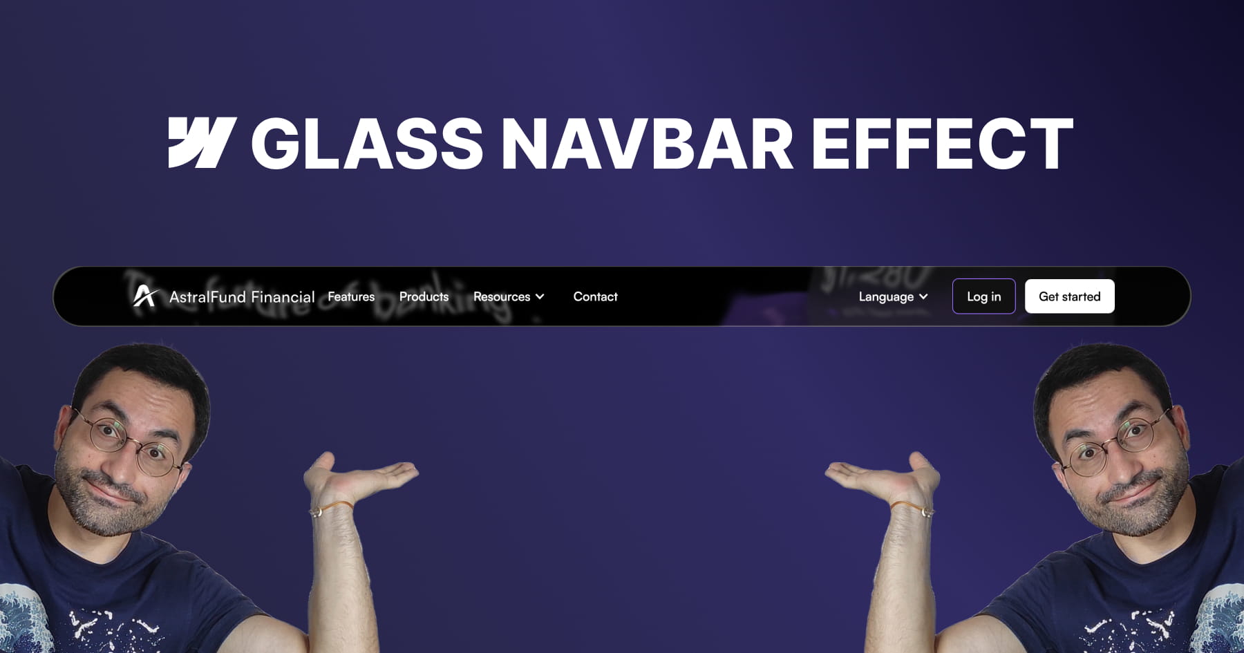
How to Build an Apple-Inspired Liquid Glass Navbar in Webflow
This tutorial provides a comprehensive guide for Webflow developers seeking to replicate Apple’s sophisticated "liquid glass" user interface effect, a design trend characterized by smooth distortion and organic fluidity. The core value of this lesson lies in its accessibility; the instructor demonstrates that achieving this high-end aesthetic does not require heavy external libraries or complex Javascript. Instead, viewers learn to leverage native Webflow elements combined with a lightweight SVG filter to create a professional, performance-friendly visual component that elevates modern UI designs.
The methodology detailed in the video centers on mastering advanced layering techniques to simulate physical glass properties. Viewers are guided through constructing a structured navigation bar containing three distinct layers: one for the blur and distortion, one for a subtle color tint, and a final layer for "shine" using inner box shadows. Crucially, the tutorial demystifies the use of SVG filters, teaching users how to embed custom code to generate a displacement map. This allows for fine-grained control over the distortion effects, enabling the background content to warp organically as it scrolls beneath the navigation bar.
By the conclusion of this module, the viewer will have achieved a fully functional, responsive, and sticky navigation bar that mimics the premium "frosted" look of Apple's recent design language. Beyond the specific effect, the video instills transferable best practices for scalable web design, such as using "inherit" values for border radii to ensure internal layers automatically adapt to their parent containers. Users will walk away with the confidence to manipulate SVG code parameters—specifically scale and turbulence—to customize visual distortions for future creative projects.

How to Build GSAP Draggable Cards in Webflow
This instructional module provides a comprehensive framework for engineering high-fidelity "swipe-to-toss" interactions within Webflow, replicating the tactile engagement found in physical card decks or instant photo galleries. By leveraging a "no-code" attribute-based system, the tutorial bridges the gap between complex JavaScript animation and visual development, enabling designers to implement sophisticated drag physics without writing code from scratch. The core value lies in its ability to transform static layouts into dynamic, satisfying user experiences suitable for portfolios and product showcases.
Viewers will learn to architect a robust HTML structure that manages absolute positioning and overflow behaviors to ensure a polished, glitch-free interface. The guide details the precise implementation of custom attributes (such as fc-dragable-card) to link UI elements—including wrappers, cards, and reset triggers—to the underlying interaction script. Furthermore, the specific configuration of CSS properties, such as pointer-events, is explained to ensure that the interactive stack does not obscure underlying functional elements like buttons.
By the conclusion of this lesson, users will achieve a fully scalable solution that integrates seamlessly with Webflow CMS Collections, utilizing structural selectors to apply dynamic styling variances like card tilt. The resulting component is fully responsive, optimizing the experience for mobile devices by adjusting wrapper dimensions and border styles. Additionally, users will understand how to granularly customize the interaction's physics—modifying rotation sensitivity, throw distances, and easing functions—through simple attribute adjustments to match their specific brand aesthetic.
How to Build an Apple-Style Image Sequence Animation in Webflow
This tutorial empowers web designers to replicate the iconic, fluid scroll animation found on the original Apple AirPods Pro landing page, moving beyond common shortcuts like Lottie files to rebuild the effect from first principles using Webflow and GSAP ScrollTrigger. The core value lies in its comprehensive, high-fidelity workflow: rather than relying on video tags, the user learns to manipulate a sequence of approximately 150 high-resolution frames that update dynamically with the user's scroll, ensuring a "perfectly fluid movement" that feels interactive and premium. This approach grants designers total control over the visual progression and performance of the animation without sacrificing quality.
The instructional journey bridges the gap between design and development by introducing a sophisticated asset management strategy. Viewers achieve proficiency in a complete "no-code" friendly pipeline that includes extracting frames from video sources, compressing them into efficient AVIF formats, and—most critically—leveraging the Webflow API via Postman to automate the retrieval of asset URLs. This eliminates the tedious and error-prone process of manually copying hundreds of file links, providing the user with a scalable, reusable method for accessing project assets programmatically.
By the conclusion of this masterclass, the viewer will have implemented a fully responsive, accessible scroll-scrubbing component using HTML5 Canvas and sticky positioning. The final architecture allows for extensive customization through simple HTML attributes, enabling designers to control parameters such as playback speed, start/end trigger points, and image fitting (cover vs. contain) across different device breakpoints. The result is a professional-grade, highly optimized interaction that enhances user engagement while adhering to inclusive design standards.
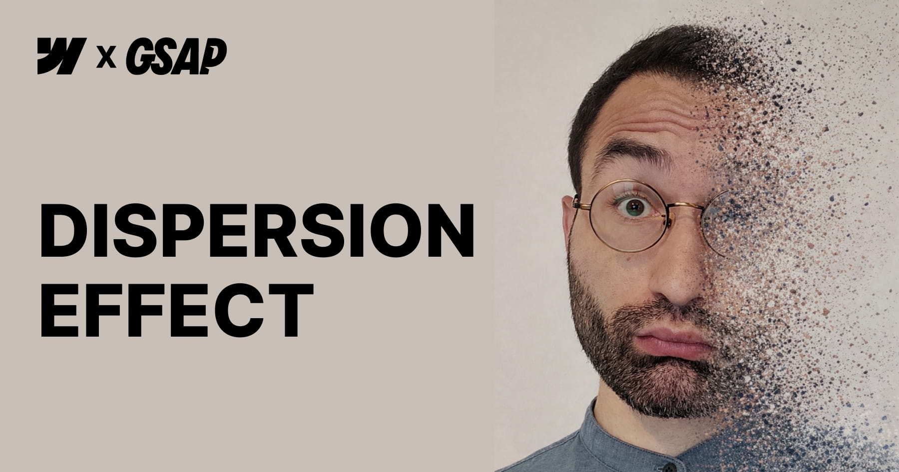
How to Create a GSAP Disintegration Effect in Webflow
This tutorial empowers Webflow developers to implement a high-impact "disintegration" visual effect powered by GSAP ScrollTrigger, designed to elevate the visual storytelling of a website without requiring manual JavaScript coding. The core value of this resource lies in its "low-code" architecture; viewers will achieve a cinematic animation where images fragment into particles upon scroll simply by applying specific custom attributes to standard HTML elements or CMS content. By abstracting complex logic—such as html2canvas snapshotting and pixel manipulation—into a configurable script, the video enables designers to focus purely on visual implementation and layout strategy.
Viewers will gain a comprehensive understanding of how to configure and control the animation's behavior directly within the Webflow Designer. The tutorial details how to manipulate specific parameters through optional attributes, allowing for precise control over the rotation angle, particle scatter amplitude, and the exact scroll start and end triggers. Furthermore, the guide emphasizes the critical structural requirements necessary for the effect to function, such as utilizing non-static positioning for parent components and managing overflow settings to prevent layout issues as fragments disperse.
Finally, the video ensures the resulting designs are production-grade by addressing performance optimization and accessibility standards. Users will learn strategies to mitigate the high computational cost of the effect—such as limiting usage to key visuals and optimizing image resolution—while verifying that screen readers can still access "alt" text even after the image is converted into canvas elements. The session concludes by demonstrating how to harmoniously layer this custom effect with native Webflow interactions, resulting in a cohesive and sophisticated motion system.

How to Create an Infinite Marquee in Webflow
This instructional video provides a comprehensive update to the popular "infinite marquee" solution for Webflow, empowering users to implement sophisticated scrolling animations using a completely no-code approach. The core value of this tutorial lies in its ability to eliminate the need for writing JavaScript; instead, viewers achieve full configuration—including scroll direction and speed—directly through custom attributes applied within the Webflow designer. This ensures that even users without coding knowledge can deploy high-performance, continuous animations that integrate seamlessly with Webflow’s native interactions.
The guide introduces several advanced features that significantly enhance design flexibility and user experience, such as smooth pause-on-hover, drag toggling, and specific styling for the "active" slide within the marquee. Users will learn how to ensure full responsiveness by setting unique speeds for different breakpoints, preventing layout issues on mobile or tablet devices. Additionally, the video demonstrates how to apply these techniques to both static content and Webflow CMS Collections, allowing for dynamic, data-driven marquees.
Finally, the tutorial prioritizes implementation standards and accessibility. It outlines a strict class-naming convention based on the Splide library—requiring specific classes like splide__track and splide__list—to ensure functionality. The viewer will also master accessibility best practices by learning how to apply aria-label or aria-labelledby attributes, ensuring the marquee is usable for all site visitors. The process concludes with a simple copy-paste workflow for the necessary script, requiring no further modification by the user.

How to Build a Horizontal Masonry Layout in Webflow
This tutorial provides a comprehensive guide to constructing a responsive horizontal masonry layout in Webflow, utilizing Flexbox to achieve a clean, no-code solution. The instructor moves beyond vertical layouts to demonstrate how images can fill horizontal rows while strictly respecting their original aspect ratios, a method inspired by classic CSS techniques. By starting with static elements and progressing to dynamic content, the video ensures viewers understand the foundational mechanics of Flexbox properties—specifically wrapping and sizing behavior—to create a visually cohesive gallery that functions seamlessly across all device sizes.
A central pillar of this lesson is the strict adherence to web accessibility standards. The layout is constructed using unordered lists (<ul>), which allows screen readers to correctly interpret the gallery as a structured sequence of connected items rather than a collection of unrelated div blocks. The tutorial addresses complex edge cases, such as the visual formatting of the final row, by introducing a "phantom" empty list item. Crucially, the presenter explains how to hide this decorative element from assistive technology using the aria-hidden attribute, ensuring the visual fix does not compromise the user experience for those relying on screen readers.
Finally, the video expands the utility of this layout by integrating it with Webflow’s Content Management System (CMS) and adding professional polish through animation. Viewers will learn to manipulate the "Last Item" selector within a collection list to replicate the layout logic dynamically, using custom fields to manage accessibility attributes. The session concludes by demonstrating how to fine-tune responsiveness by switching between viewport height and width units for tablets and mobile devices, and implementing a staggered GSAP animation to create a sophisticated, dynamic entry effect for the gallery items.

How to Build a Logo Glow Hover Effect in Webflow
This tutorial provides a comprehensive guide to constructing sophisticated, "glowing" logo animations within Webflow, utilizing a completely no-code approach. Francesco demonstrates how to elevate standard web elements by combining fundamental transform operations with advanced visual techniques directly in the Webflow Designer. The core value of this lesson lies in demystifying the integration of complex CSS features—specifically custom properties for masking and blur backdrop filters—to achieve a high-fidelity aesthetic that creates a sense of depth and dimensionality usually reserved for custom-coded implementations.
The technical instruction focuses heavily on the structural hierarchy required to support these advanced effects. Viewers will learn to manipulate the relationship between relative and absolute positioning to create a multi-layered canvas where gradient fills and specific aspect ratios interact seamlessly. A pivotal portion of the training covers the use of Webflow custom properties to apply mask images, allowing designers to transform simple div blocks into intricate, logo-shaped elements that serve as the foundation for the glowing visual effect.
Finally, the video culminates in the creation of a dynamic mouse hover interaction that brings the static design to life. By staggering opacity, scale, and movement across multiple layers, the user learns to build a responsive animation that reacts organically to cursor movement. The tutorial covers the entire animation lifecycle—from establishing initial states to applying "ease out cubic" timing functions—empowering designers to build engaging, interactive components that significantly enhance the visual storytelling of their digital products.

Master Glitch Logo Animations in Webflow
This tutorial provides a sophisticated, technical guide on engineering a "glitch" style logo animation within Webflow using a completely no-code methodology. The instructor outlines a specific structural setup involving a "logo wrapper" and three distinct image layers: a relative foreground layer and two absolutely positioned background layers. By manipulating CSS filters on these background layers, the user learns to generate distinct red and bluish-green color offsets that serve as the visual foundation for the glitch effect, eliminating the need for external asset preparation.
The core instruction focuses on constructing the "Logo Glitch Animation" within Webflow’s interaction panel, specifically triggered by a mouse hover state. Viewers will achieve this effect by sequencing rapid "Move" transforms with short durations (0.06 seconds) to simulate jerky, random displacements of the colored background layers. Simultaneously, the tutorial demonstrates how to apply a subtle blur filter to the foreground layer, adding a necessary distortion texture that mimics digital interference.
By mastering this workflow, designers can significantly enhance the interactivity and engagement of brand links or navigation elements without relying on custom code. The technique is demonstrated to be highly versatile, supporting both standard images and embedded SVGs, where the "Current Color" property allows for dynamic styling that integrates seamlessly with the site's design system. This resource ultimately empowers users to deploy high-end motion graphics that elevate the professional polish of their Webflow projects.

How to Build 3D Scroll Animations in Webflow
This instructional video serves as a comprehensive Webflow Master Class designed to guide developers through creating a sophisticated, 3D "while scrolling" animation entirely without code. The core value lies in its detailed breakdown of a complex layout where elements—specifically cards—stack dynamically using sticky positioning and 3D perspective. By leveraging a section height of 600VH to control animation speed and utilizing a sticky main container, the tutorial demonstrates how to transform a standard static layout into an engaging, immersive narrative experience ideal for showcasing client testimonials or process steps.
The technical instruction focuses heavily on the mathematics and logic behind seamless animation timelines. Viewers will learn how to calculate precise offsets and distribute the animation duration across multiple elements to ensure fluid movement. The guide moves beyond simple movements by teaching how to manipulate the Z-axis and "children perspective" properties to create depth, making cards appear to move farther away from the screen as they stack. Additionally, the video covers the integration of Webflow components to streamline the design process, allowing for rapid content updates without breaking the animation structure.
By the conclusion of this tutorial, the viewer will have achieved a fully responsive, high-performance interaction that works flawlessly across all device sizes. The instructor emphasizes a "mobile-first" mindset by using viewport height (VH) units for sizing and spacing, ensuring the animation adapts natively without extensive media queries. Furthermore, learners will master the technique of layering different interaction types, combining "while scrolling" triggers with "scroll into view" effects to maximize user engagement and visual polish.

Master Scroll Animations in Webflow
This tutorial provides a comprehensive masterclass on engineering sophisticated, native scroll-triggered animations within Webflow, eliminating the need for custom code. The core value lies in teaching developers how to seamlessly transition hero section elements—whether they are standard image logos, 3D Spline models, or typography—into a fixed navigation bar as the user scrolls. By leveraging a structure where the hero section "sticks" to the top of the viewport, the video demonstrates how to execute fluid transformations that scale down and reposition elements with pixel-perfect precision.
The instruction goes beyond basic movement, delving into advanced workflow techniques such as the integration of Webflow Variables to animate properties like font size and navbar padding. The tutorial analyzes four distinct architectural scenarios, ranging from simple centered logos to complex bottom-aligned text that requires precise calculation to land centrally in the navbar. Significant emphasis is placed on the use of consistent viewport units (VH and VW) to ensure that animations remain responsive and retain their aspect ratios across different device sizes.
By mastering these techniques, the viewer will achieve the ability to manipulate animation timing and velocity through the strategic sizing of layout elements. The video demystifies the logic behind animation boundaries and offsets, providing the mathematical formulas necessary to control exactly when an interaction begins and ends. Ultimately, learners will walk away with the skills to transform static designs into immersive, dynamic interfaces that feel "alive" and professional.
How to Create No-Code GSAP Staggered Animations in Webflow
This tutorial presents a powerful, no-code methodology for integrating GreenSock Animation Platform (GSAP) staggered animations directly into Webflow projects. By leveraging a specific set of custom attributes, designers can apply sophisticated slide and fade effects to gallery layouts or collection lists without writing a single line of JavaScript. The core instruction focuses on applying the primary fc-gsap-stagger attribute to a parent wrapper, instantly enabling complex motion effects that are traditionally reserved for advanced developers.
The true value of this approach lies in the granular control it provides over the animation's behavior and timing. Viewers are equipped with the knowledge to manipulate critical variables such as the vertical offset, animation duration, easing functions, and the specific time interval between elements using attributes like each or amount. Furthermore, the system supports advanced sequencing capabilities, enabling animations to originate from various starting points—such as the center, edges, or a randomized order—providing significant creative freedom to match specific design requirements.
Ultimately, this solution is designed for high scalability and versatility across diverse site architectures. The tutorial demonstrates that the attributes function flawlessly with multiple unique lists on a single page, Webflow CMS collections, and complex custom grid layouts. By mastering these techniques, users will achieve a high-end, interactive aesthetic for portfolios, testimonial sections, or content lists, significantly elevating the user experience through professional-grade motion design.

How to Master Staggered Animations in Webflow
This tutorial addresses a common frustration for Webflow developers: the inability to natively create responsive staggered grid animations without resorting to complex JavaScript or impractical manual workarounds. While Webflow allows for scroll interactions, it lacks the native ability to detect when a full row of elements scrolls into view to apply sequential delays, particularly when the number of columns changes across different devices. The core value of this video lies in its elegant, low-code solution that leverages standard CSS properties to bypass these limitations, ensuring high performance and ease of use.
The methodology combines custom attributes with the CSS transition-delay property and media queries to control animation timing dynamically. Instead of building complex timelines for every breakpoint, the viewer learns to set up a simple "scroll into view" trigger in Webflow that toggles opacity and movement, while a snippet of custom CSS mathematically calculates the delay for each item based on its column index. This approach allows developers to define building blocks of code that correspond to the number of columns at specific breakpoints, ensuring the staggered effect remains consistent whether the grid displays one, three, or five columns.
By mastering this technique, viewers will achieve a scalable animation system that works seamlessly with CMS Collections and dynamic content, which is impossible with manual interaction targeting. The tutorial provides a comprehensive guide on configuring the code for various layouts, including adding custom breakpoints and managing multiple grids with different structures on a single page. Ultimately, this solution empowers developers to create sophisticated, professional-grade entry animations that are fully responsive and easily maintainable without heavy code overhead.

How to Build a Dynamic Grid Gallery in Webflow
This tutorial presents a sophisticated solution for implementing dynamic, CMS-driven image grids in Webflow that respect the original aspect ratios of visual assets. Unlike standard grid implementations that rely on object-fit: cover—which often creates undesirable cropping—this method utilizes a custom script configured via simple attributes to calculate precise row heights and widths automatically. The core value lies in the ability to create "masonry-like" layouts where images of varying proportions share rows seamlessly while maintaining perfect alignment and full visibility, ensuring that every detail of a portfolio or gallery is preserved.
The technical instruction focuses on a low-code implementation strategy, requiring users to apply specific attributes such as fc-gallery="list" to container wrappers and fc-gallery="item" to child elements. The presenter details the cascading logic of the system, where column counts set for larger breakpoints (e.g., via columns-desktop) automatically apply to smaller devices unless explicitly overridden by specific attributes like columns-tablet. This granular control allows designers to define exactly how many images appear per row across Desktop, Tablet, Landscape, and Portrait views without writing complex media queries.
By the end of this video, users will achieve a highly flexible, scalable workflow capable of handling both dynamic CMS collections and static content blocks with equal precision. The tutorial also addresses critical production details, such as handling incomplete rows to prevent layout distortion and optimizing loading performance by manually setting item widths to ~40% in the Designer. This specific step ensures Webflow generates and serves high-resolution image assets rather than pixelated thumbnails, guaranteeing a professional finish for high-end web projects.
How to Master Scalable Text Reveal Animations in Webflow
This instructional module details the implementation of Finsweet’s Mirror Input Values solution, a no-code method for synchronizing Webflow input fields in real-time. The tutorial demonstrates how to leverage simple custom attributes to instantly reflect user data from a "trigger" field to a "target" field, thereby creating dynamic and engaging web experiences without requiring complex programming knowledge.
Viewers will learn to configure sophisticated form behaviors by manipulating Webflow custom elements, converting them into read-only inputs or text areas to display dynamic content. The guide specifically covers technical nuances, such as setting the "tag" property to input and applying specific type attributes, enabling developers to build personalized greetings and real-time visual previews effectively.
Beyond basic setup, the video outlines three distinct architectural patterns: creating personalized UI messaging, generating live content previews for items like postcards, and auto-filling complex forms to reduce user error. The lesson concludes with high-level best practices, urging developers to prioritize User Experience (UX) by clearly labeling linked fields and implementing mirroring features only where they genuinely enhance the user journey.