In this blog post, you'll learn about a Webflow development framework designed to simplify building and managing your website, even with a large team.
This framework directly addresses common challenges with existing approaches, such as limitations in design mode usage, unintentional style changes, and a lack of design consistency. We achieve this by leveraging a specific set of Webflow features: components with properties, co-dependent variables organized into libraries, and a clear naming system for CSS classes. The combination of these tools creates a framework that is both customizable and scalable, proving friendly for both developers and clients alike.
Challenges
First, I'll share the challenges we're trying to solve with this approach. I believe these challenges are common not only within our team but also among our clients and likely other Webflow users worldwide.
One Designer at a Time: A Team Bottleneck
Webflow's Designer workspace seats come at a higher cost than other seat types, yet they are essential for comprehensive control over website design, including creating new pages.
A key limitation is that Webflow restricts Design mode to a single user at a time, with page branching only available as an Enterprise feature.
These two factors significantly constrain the number of team members who can actively build new website pages. This bottleneck can lead to slower time-to-market and missed opportunities.
Unintentional style changes break the whole website
Webflow's class system is a standout feature, differentiating it from many other no-code web development platforms. It enables rapid, site-wide design changes.
However, this power necessitates careful usage. Inexperienced users often make a change to one class, unintentionally affecting numerous elements across the entire website, leading to broken layouts.
Inconsistent design ruining brand image
While Webflow classes facilitate style consistency across multiple elements, users often create separate, redundant classes to prevent unintended changes or due to a lack of pre-planning. This common practice frequently leads to style inconsistencies, such as variations in text size, spacing, or border-radius across different pages.
Endless workarounds for localized content
Currently, creating distinct page structures for different locales on an international Webflow site is challenging. Without an Enterprise plan, it's not possible to simply remove specific elements for a particular locale.
Solution
To overcome these challenges, we've developed a system that leverages several Webflow features in a unique way. This approach simplifies the development process, increases effectiveness, and ensures consistency.
Here are the three core pillars of our system:
Component-Based Page Construction
Pages are built exclusively from components, utilizing their slots and properties capabilities. This modular approach ensures flexibility and reusability.
Scoped Class Usage
Classes are primarily used and named with a strict limit to their specific component. This prevents unintended site-wide style conflicts.
Variable-Driven Style Consistency
Variables are integrated within classes to guarantee the consistency of styles across the entire website, simplifying global updates and maintaining design integrity.
Now lets have a closer look at these pillars and the way they use Webflow features.
Components
Building pages entirely with components significantly simplifies the process for non-designers working in Webflow's Build mode. Even though Build mode restricts design changes, it fully supports working with existing components and creating new pages using them.
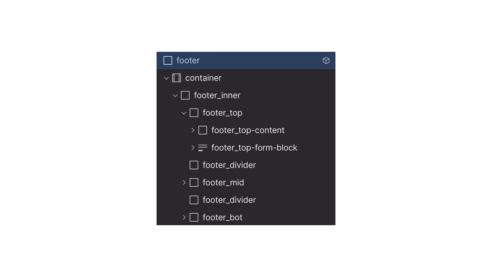
To ensure every page has essential elements, we utilize a global "page wrapper" component. This wrapper includes common elements like the navbar, footer, cookie consent window, and custom code. The page wrapper component features a slot property, allowing us to easily insert various page sections such as headers, feature sections, and testimonials. These sections are also built as components and can contain their own nested slots.
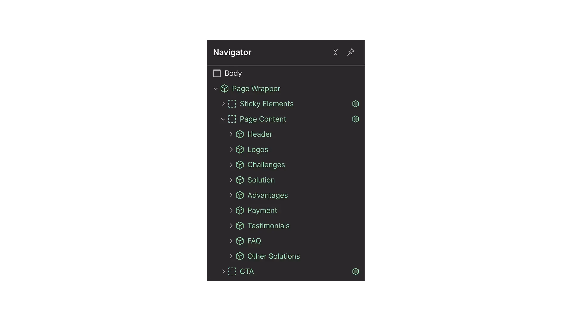
Utilizing a global 'page wrapper' component is superior to Webflow's page template function because changes to a template only affect future pages built with it. If you decide to add a new component to all pages, adding it to a template will only apply to new creations. Existing pages would require manual updates. The page wrapper component solves this; adding a component within it automatically propagates that change across all existing pages, ensuring consistency and saving significant manual effort.
Slots within components offer a high degree of content flexibility. We use them to add diverse content like images, backgrounds, icons, and buttons. This empowers users in Build mode to "design" pages from a library of pre-built components with considerable freedom.
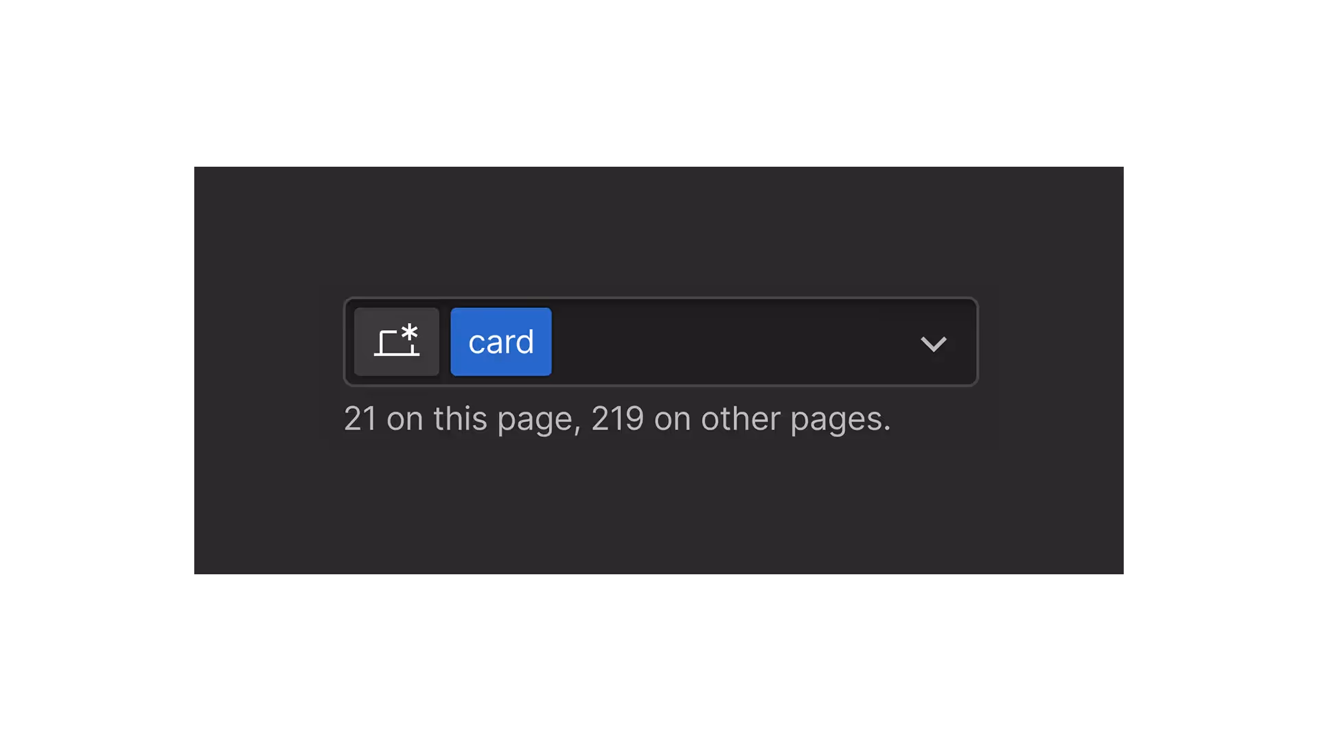
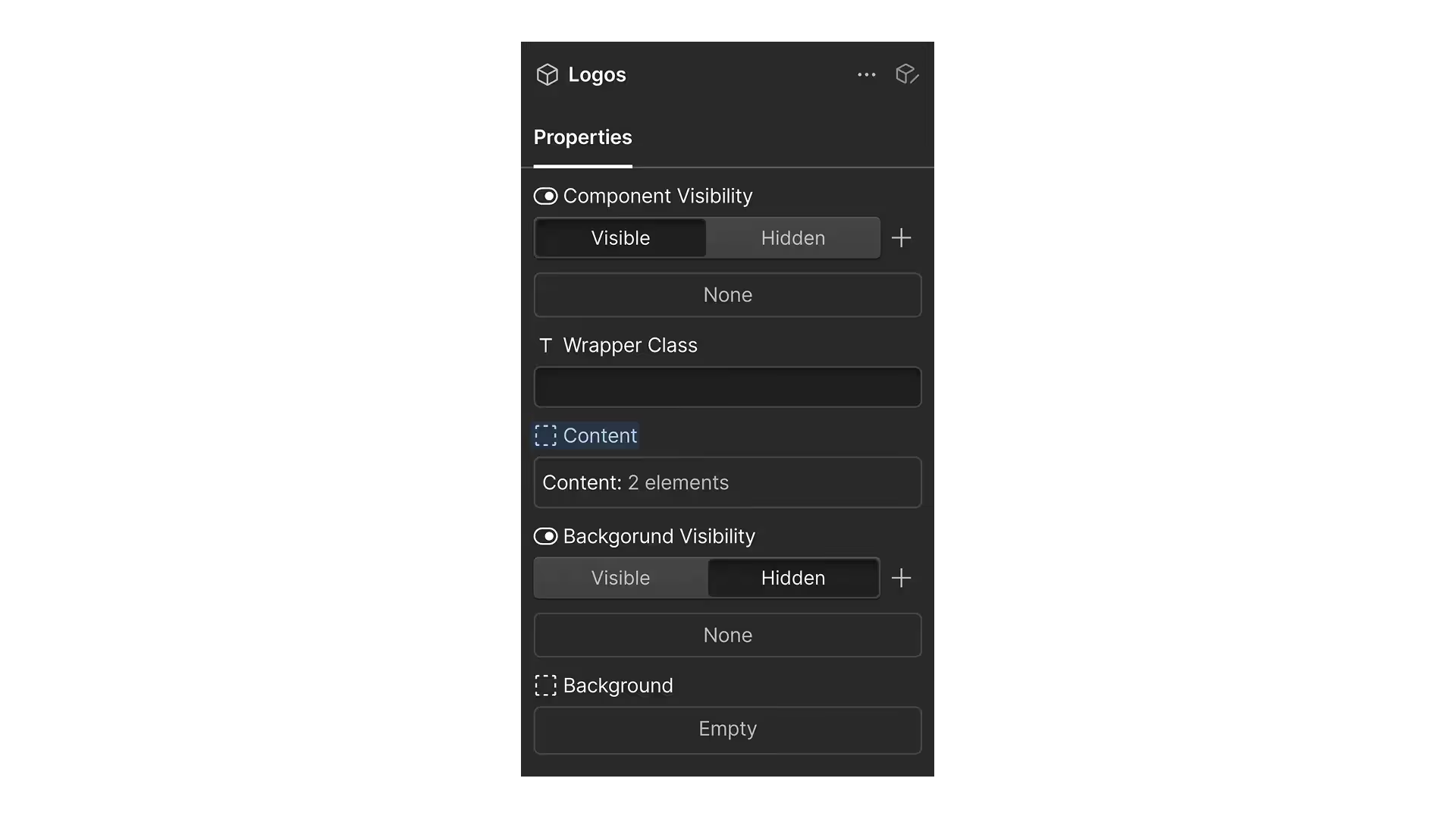
Every component also comes with its own set of properties to easily modify text, images, links, and even styles (via properties connected to a "style" attribute or variants). All our components include two essential properties: "Component Visibility" and "Wrapper Class."
The "Component Visibility" property is crucial for localized websites. It allows us to toggle a component's visibility for the primary or any secondary locale, enabling us to adapt page structures to specific regional requirements.
The "Wrapper Class" property helps us apply custom styles to components. For instance, I often use it to add margins between components by simply typing a class name like "margin-bottom-L" into the property field. (Naturally, this CSS class must be predefined elsewhere in the website's stylesheet for it to work.)
Classes
Classes are named and used in a specific way to make it easy to understand where a class is applied and prevent accidental style changes across the website.
The best practice is to use each class primarily within one particular component, with the class name indicating which component uses it. For example, for a component named "Blog Item," its classes would be named like blog-item, blog-item_heading, and so on. All classes would start with blog-item followed by suffix with a more specific description. The core part of the class name is separated from the rest by an underscore _ for easier visual recognition.
Disclamer: some global classes such as “container” may be used across many components, because they are usually same for all sections. You can also create separate container classes for each component section.
Additionally, if you want to specify the page where a class should be used, you can add a prefix. For instance, home--blog-post_heading indicates a class for a blog post heading specifically used on the homepage. The prefix is separated from the core name by a double dash --. This is useful when creating multiple variations for components like blog post items.
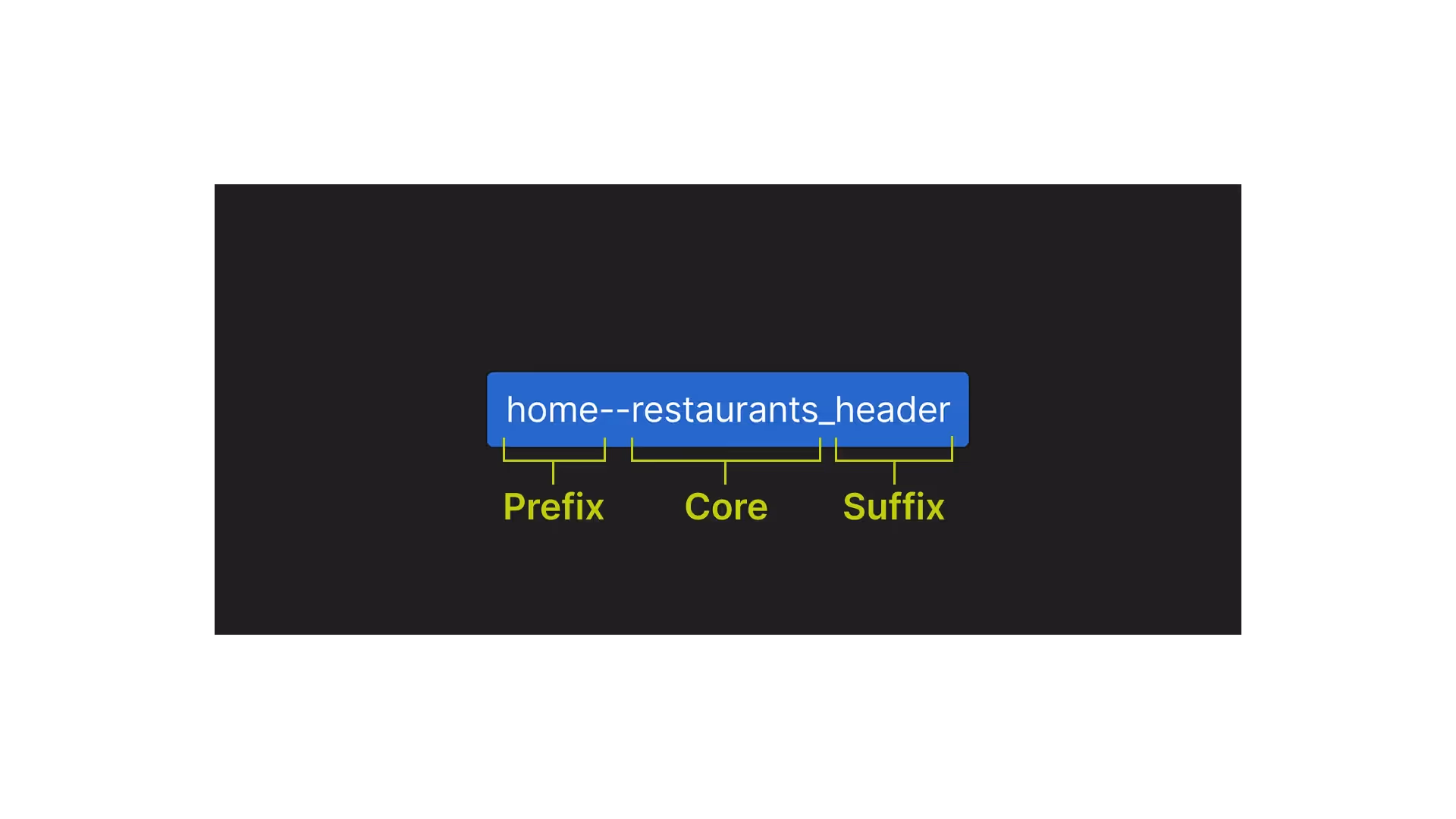
This approach allows you to identify where a class is used simply by looking at its name. It also helps isolate styles within specific components, ensuring that when someone on your team edits one component, it won't cause unintended changes to others.
Variables
Even though we use separate classes for each component, variables ensure consistent styling across your website.
Variables such as brand colors, background and border colors for cards, buttons or border radius will be essential to organize brand’s style identity.
Our approach organizes these variables into a clear, editable system using Libraries.
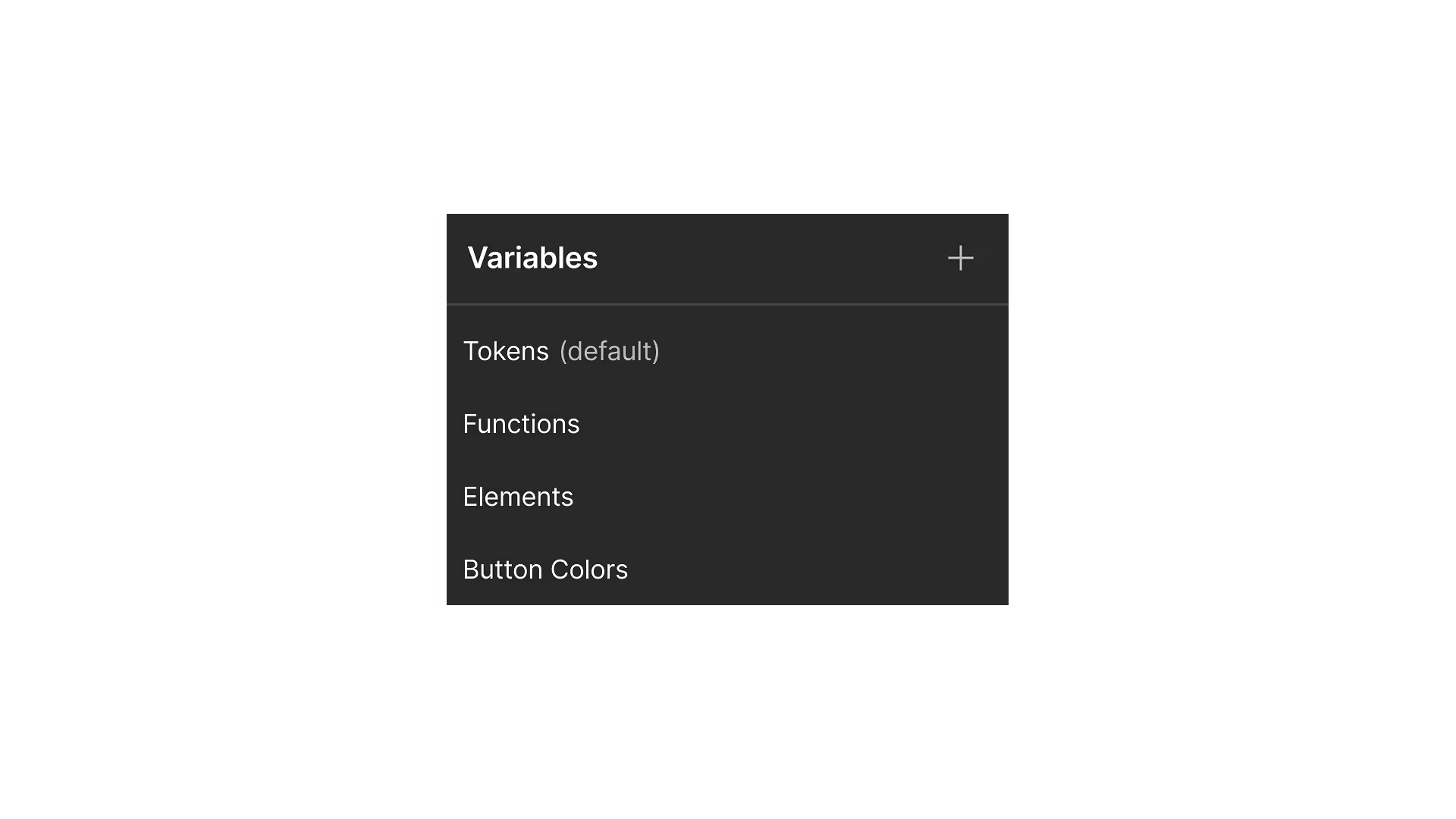
Variable Libraries
We divide website variables into three distinct types of libraries:
- Tokens: These libraries house your most basic style definitions, primarily colors and sizes. For example, you might have a color variable like
blue--basecontaining a hex code, and shades derived usingcolor-mix(). Size tokens could besize-px--size-sorsize-rem--size-m. This foundational set of variables defines your core styles. - Functions: Function libraries define variables specifically for various functional styles on your website. For instance, a
padding--padding-svariable might be assigned the value from thesize-px--size-stoken, orborder--border-mmight take its value fromsize-px--size-m. This creates a set of reusable functions for paddings, margins, text colors, border colors, and more, which are then applied to specific elements. - Elements: Element libraries contain variables tailored to specific website elements like cards or buttons. Here, a variable like
button--text-sizecould be linked to thetext--size-sfunction variable, orcard--border-radiustoborder--radius-s. When designing a component that includes a card, you can easily find and apply these styles by searching for "card" in the variable panel.
This system ensures that despite unique classes for each component, all styles remain consistent. It also makes global style changes incredibly easy; you can reassign a card's border value to a larger or smaller option from the functions library, and the change will propagate everywhere.
Variable Modes
Webflow's variable modes further enhance style management. We utilize both automatic and manual modes.
- Manual modes are primarily used for element hover states. For example, within a "Buttons" library, you can create a "hover" mode to specify a button's background color on hover, then connect this mode to the button's hover state. The same can be done for cards and links.
- Automatic modes streamline responsive design. We create modes for each breakpoint, defining variable values for those specific screen sizes. This eliminates the need to manually adjust each class across different breakpoints. Automatic modes are typically used in libraries such as "Typography" or "Card Sizes," where font sizes, line heights, paddings, or border radii need to change responsively.
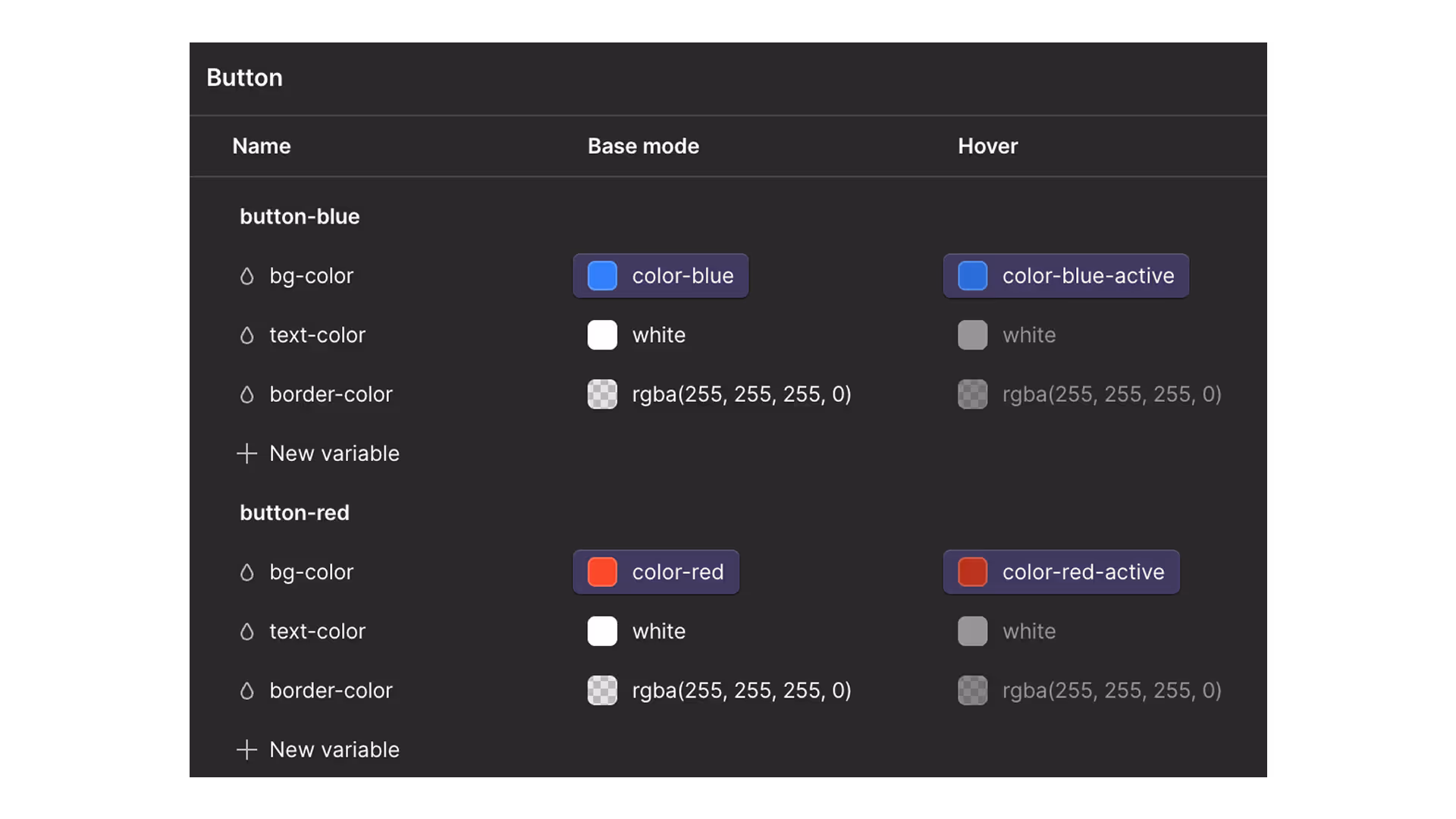

Important: Do not mix automatic and manual modes within the same library. If your cards need to change on hover and across breakpoints, create two separate libraries for cards, such as "Cards - colors" (for manual hover modes) and "Cards - sizes" (for automatic breakpoint modes).
Advantages
The development methodology outlined offers several significant advantages:
Speed of Page Building
A primary benefit is the accelerated page creation process. The component-based approach empowers non-technical team members, such as marketers, to build new pages in Webflow's Build mode independently, without requiring developer or designer support. This process can even occur in parallel with component design.
Flexibility
Components are designed with numerous slot and class properties, providing extensive room for customization and design variations. Many of these adjustments can be made without direct designer involvement—for example, simply adding an image to a background component placed within a section's background slot.
Iterative Workflow
This approach facilitates an iterative workflow for new pages. Marketers can first construct pages using basic components and input content, making the page live and functional immediately. Subsequently, designers can refine the page by adding images, icons, and specific styles to enhance its visual appeal.
Ease of Localization
The system offers substantial freedom for localization. You can toggle component visibility on and off, and easily swap images, backgrounds, or icons. It also allows for hiding specific paragraphs, list items, entire sections, or even whole page wrappers, tailoring content precisely to locale requirements.
Enhanced Design Control
Designers gain improved control as there's no need to worry about accidental style changes affecting other components when editing classes. This allows for faster creation and modification.
Consistency of Styles
Due to the systematic use of variables, element styles remain consistent across the entire website. This also simplifies site-wide changes for major design updates.
Final words
This framework isn't just a set of rules; it's a complete system for industrial development on Webflow. It gives you back control over design, speeds up page launches, and makes collaboration safe.
We've already implemented it in our clients' projects and laid the groundwork for the upcoming Supasaito Academy course.
Ready to apply this approach to your website? Book a free consultation, and we'll show you how to migrate your existing project to the new system or implement it from scratch.


.svg)
